Creative Commons

Creative Commons Certificates

Creative Commons Certificates

Following a thinkathon with some colleagues from We Are Open Co-op, Creative Commons asked if I’d help them with the aesthetic of their certification programme, which was then in it’s infancy.

Dialogue

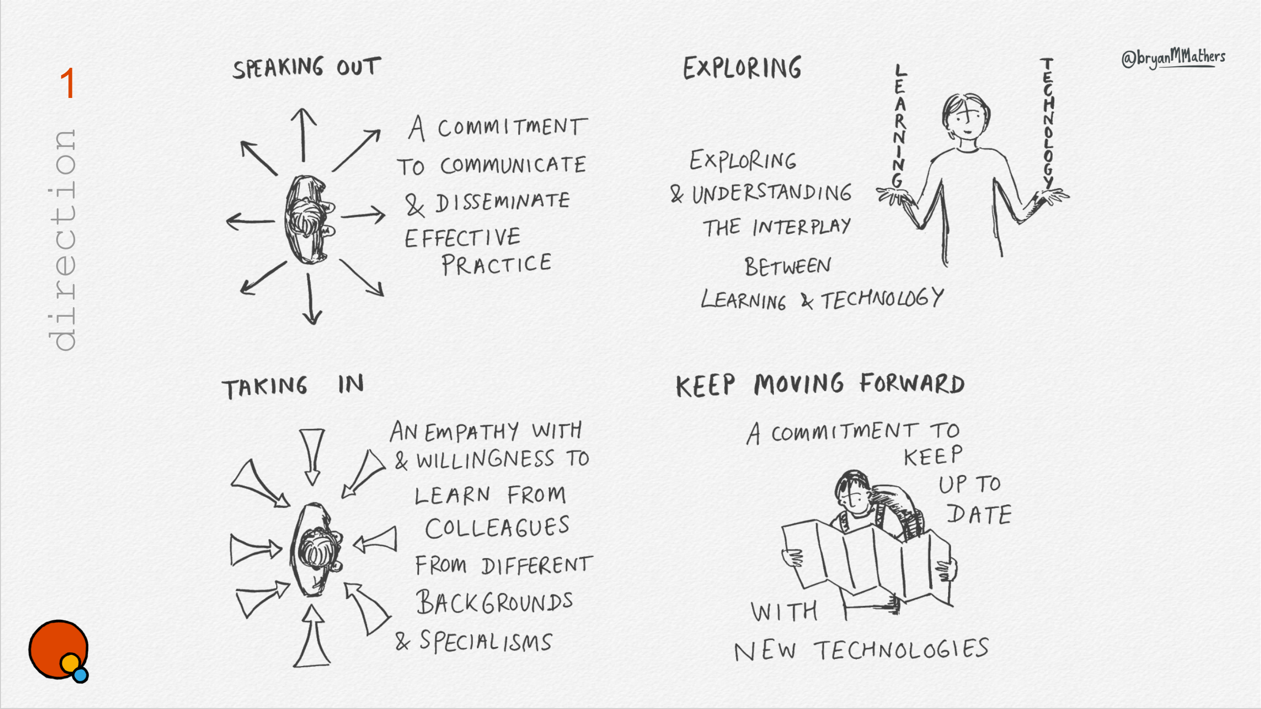
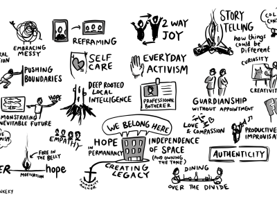
We arranged a session online with Creative Commons staff, and went sniffing for anything that looked like an idea. From abstract shape, to physical metaphor, we captured everything – believing that when played back to the stakeholders, they would recognise it when they saw it.

Here are a handful of the ideas:
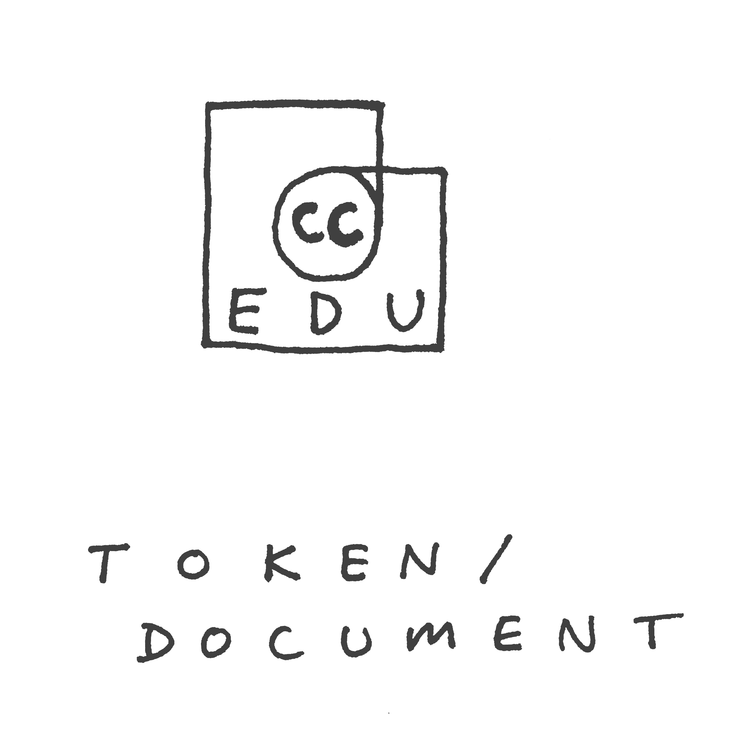
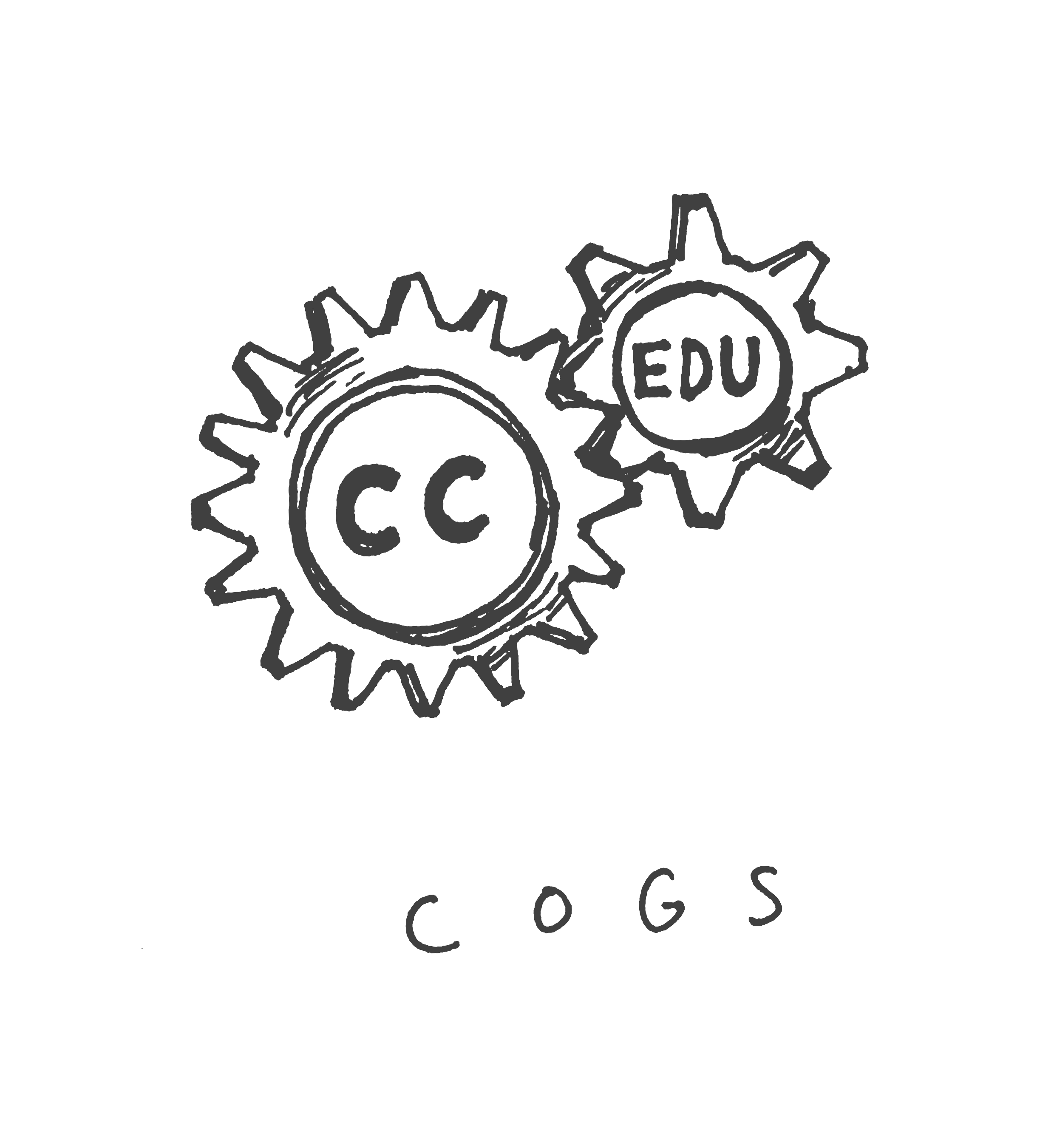
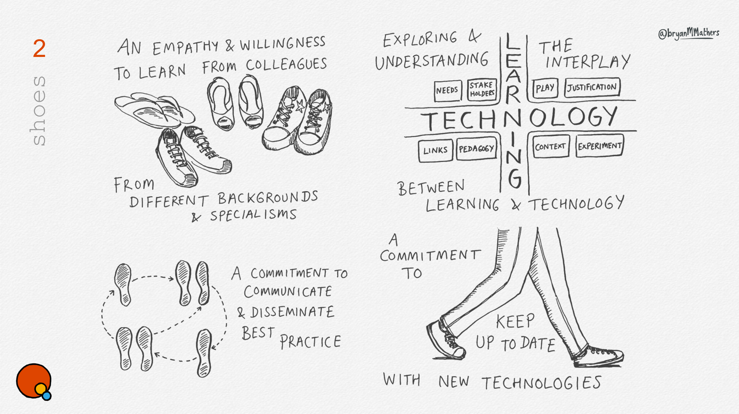
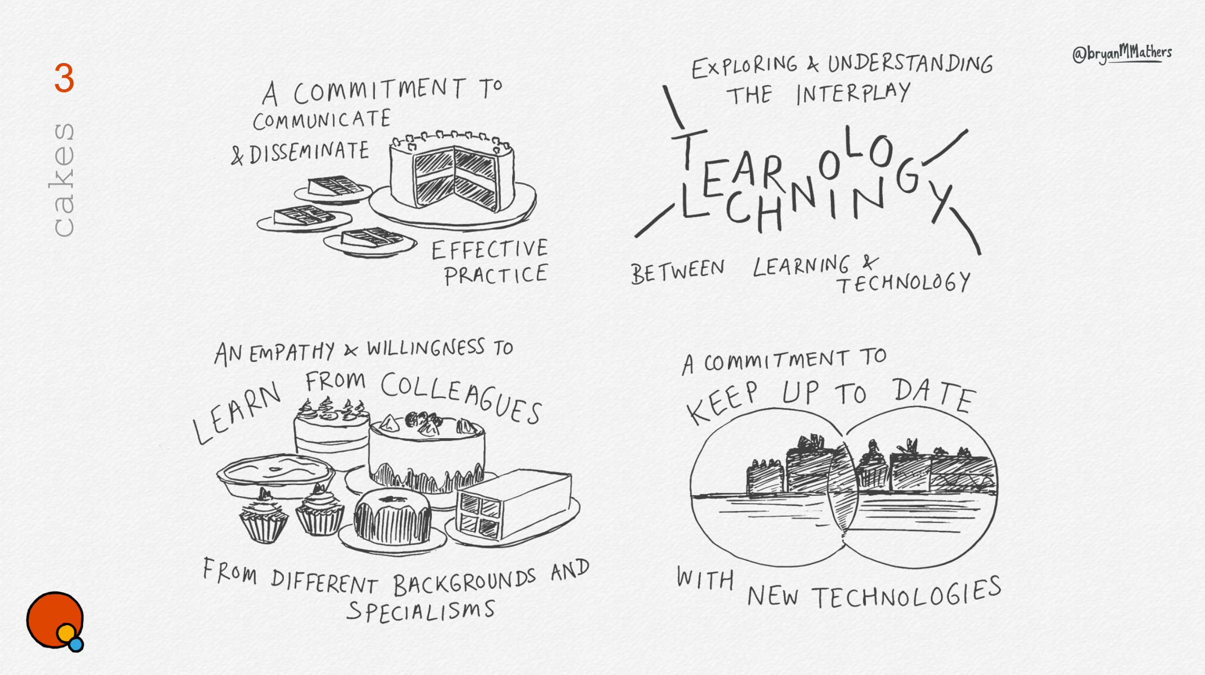
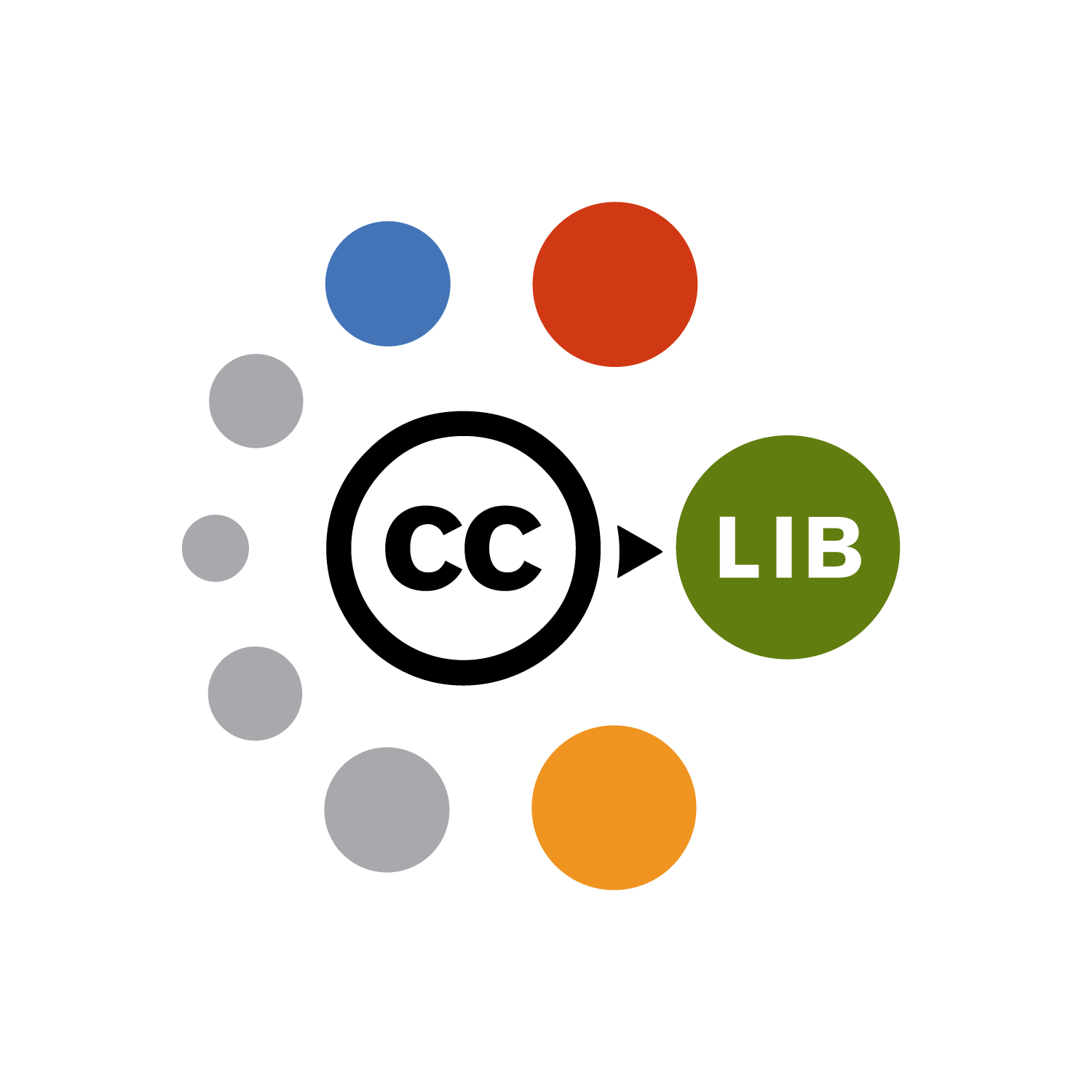
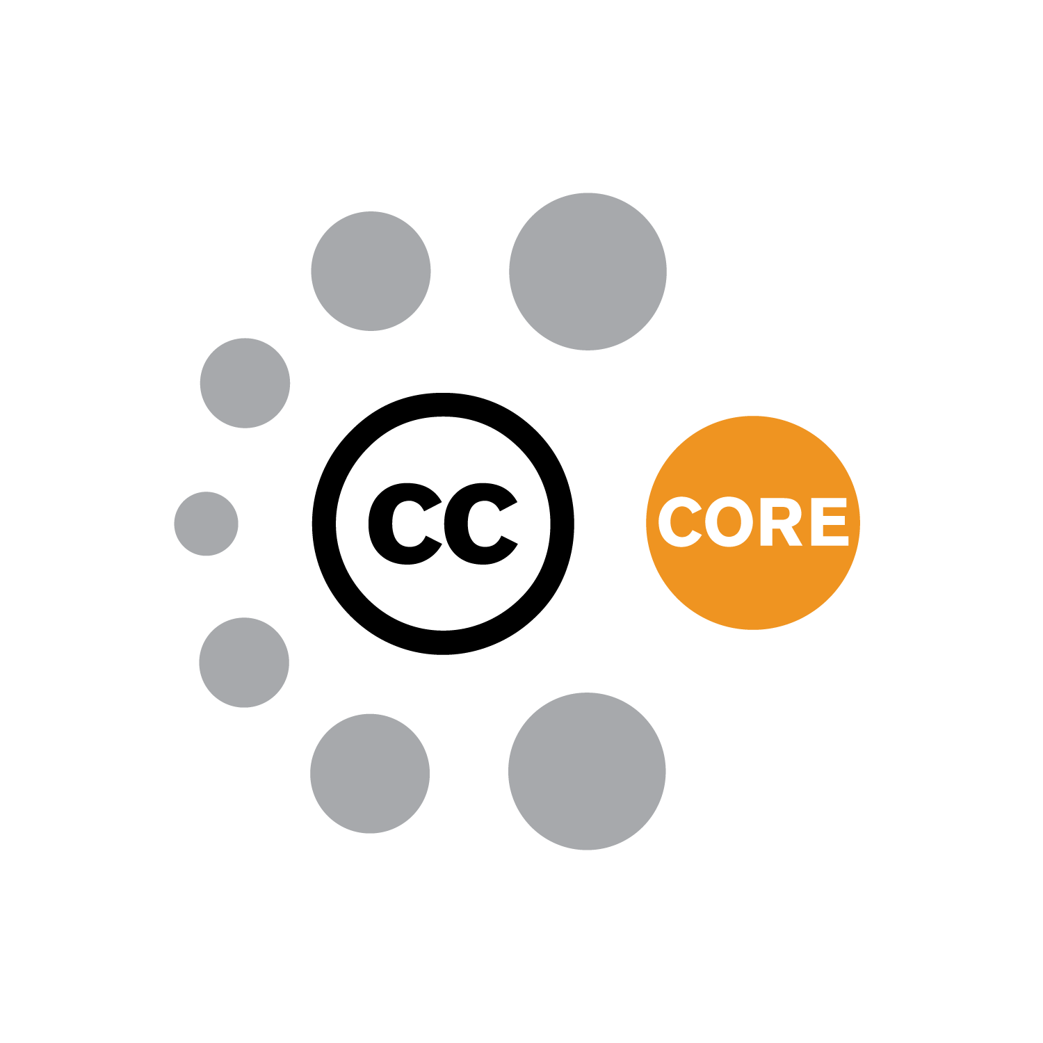
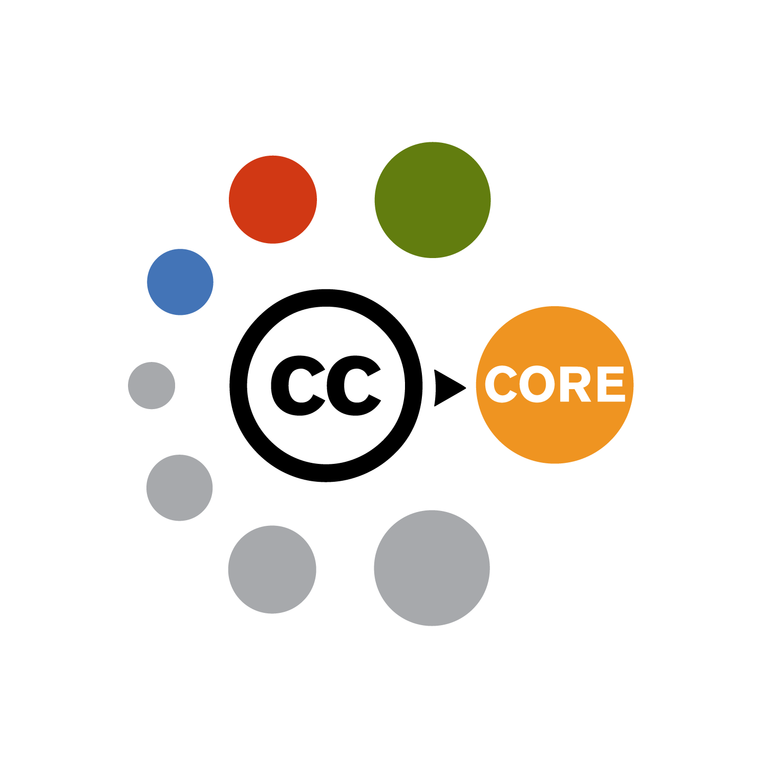
We settled on the orbit idea as the best fit for the visual identity. The CC licencing programme consists of core modules, with differing combinations of optional modules required for each area of expertise – working in Government, working in Education, working in a Library.

Distill

The next step is to create a number of variations on the core idea. Here is some of the final artwork:
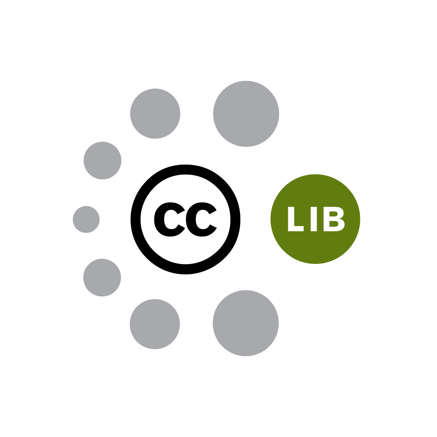
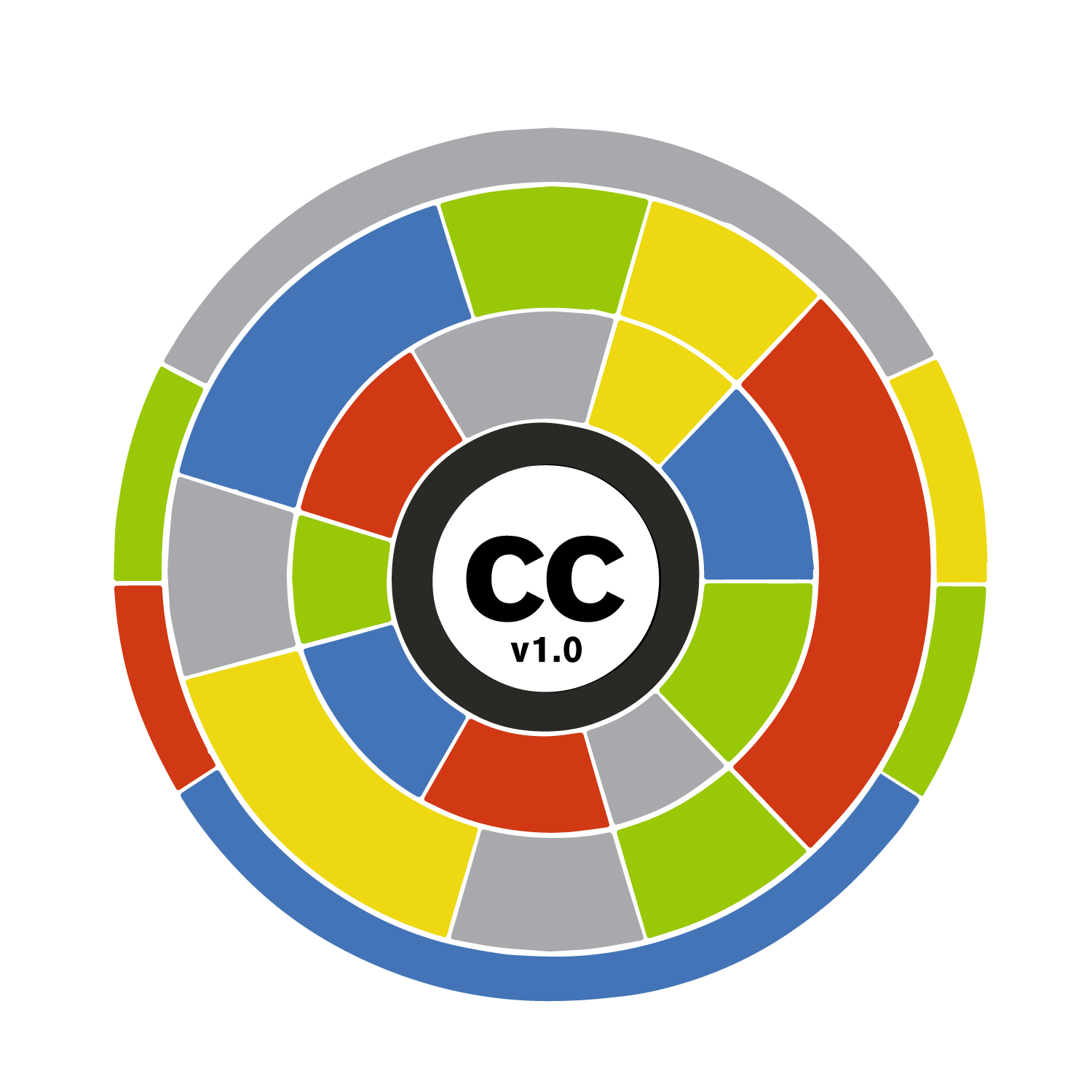
Make it move!

This was definately one I couldn’t leave alone. Those balls needed an orbit! In truth, I created a basic animation in order to create the 2D version of the logo, so taking it further using Adobe After Effects and making an animated gif wasn’t too much trouble.


CC Certificates Animation

CMALT Principles

CMALT Core Principles

CMALT Principles – a visual language

I always love working with ALT members. Openness is baked into whatever they do, so if I’m trying to capture ideas from dialogue, there is no shortage of members to get involved.

ALT asked if I would help them create a visual language for their CMALT programme, starting with the CMALT core principles.

Dialogue

ALT helpfully organised two remote dialogue sessions (using Google Hangouts), in order to involve a range of people in the collaborative process. Taking each of principles in turn, we discussed members’ understanding of each principle’s meaning and captured it using a live drawing method.

Here are the outputs of both sessions:

As you might spot, different voices produce a different conversation. Principles tend to have a degree of constructive ambiguity, resulting in multiple aligned but varied personal meanings. Of course, the more angles you can view an abstract principle from, the more chance of finding a visual metaphor that might fit.

Distill

The next step is to take those rough ideas and create a number of distilled ideas. This process culminated in the following three routes:


Artwork

The rough sketches allow us to see which of the ideas resonate, and how we can take them further.  In the end, we settled on a mash-up of two of the routes. Here’s the final artwork:

Using a visual language to articulate the core principles of our professional accreditation scheme has had real impact: candidates are now much clearer about what the principles are, more advocates have been able to use the artwork to promote the scheme and there is a stronger visual and strategic connections between this and the overall vision of the Association.

Maren Deepwell

CEO, ALT

Domains ’17

Domains 17: What are you into?

Domains ’17

Domains ’17 is a conference focused on exploring edtech and other curiosities. It’s also a collaborative partnership between Reclaim Hosting and the University of Oklahoma.

As always, any thinkery work starts with a conversation. During that conversation with Jim Groom, we explored the metaphor of the Record Fair. You never know what you might find there, what gems you might pick up. And who you might meet, some like-minded enthusiasts?

Here are the sketches that emerged from our conversation (mouse over to scroll through):

As with all projects where Jim is involved, I’m always keen to explore new territory. In this case that meant created thinkery with the purpose of animating it. Just one question bounced around my brain: how can I make it come alive? I started thinking about what would be involved in creating a poster that could be animated. Or even just wiggled a bit – to give it a bit of depth…


I was also keen to experiment with mashing up some video footage (taken with my phone) with some hand drawn artwork, to see what effect that would create.


I find it interesting how metaphor-heavy visuals could give you a feel for a conference track, as opposed to just seeing the words in print.

Here’s some more of the final artwork created to bring to life the various tracks of the conference (mouse over to scroll through):


I’m looking forward to see the conversations as they emerge from this conference…

Reclaim Hosting

An aesthetic logo

Reclaim Hosting

Back in the summer of 2015, I was sipping a coffee in Barcelona with Jim Groom, co-founder of Reclaim Hosting. I couldn’t help notice how he talked about his edtech startup. It struck me that he talked as if he was the owner of an independent indie record store. And so the “Reclaim Records” aesthetic was born… (here’s Jim’s take on it)

Firstly we looked through all the messages of Reclaim Hosting through the new lens of this fresh metaphor. Greatest hits, Classic Albums, Record sleeves, Stereo, the shop itself. Every time we came back to the metaphor, it gave us a different idea. Each individual message demanded a graphic. Following that, we thought about spinning it up – and making the records play. Each idea a journey that enveloped the previous graphics and incorporated them.

Inside the store...
Now in stereo - backup as default
A domain of one's own
Edupunk
Reclaim Records

Say Hello!
If you'd like to talk with us about a project, we're all ears!