What is it we do again?

What is it we do again?
I am a cobbler. I spend so much time with other people’s shoes that I completely neglect my own. Every once in a while, when there is a big enough lull in the pipeline of work, I experience some lost-ness which results in me second-guessing everything I do. This is the season I am currently in and although somewhat disconcerting, it does have its upside.
When I’m busy, I yearn for the mental space to be able to tumble some things around. Lost-ness has been crucial to me discovering new paths (the Remixer Machine being a good case in point) – to have the time for curiosity to nudge me through a different door.
I have a good look at the path beneath my feet and I wonder how it got there. Then I notice my shoes. Boy, do they really need some love…

I wonder how someone is supposed to understand the services provided by Visual Thinkery, if we don’t try to explain what they are and how they work. So I sit down to try to articulate what we actually do. I already share lots of examples of the creative output (recently updated!) on the website. But the Visual Thinkery process itself is where the gold lies – and our clients really only see why it works once they’ve been through that process.
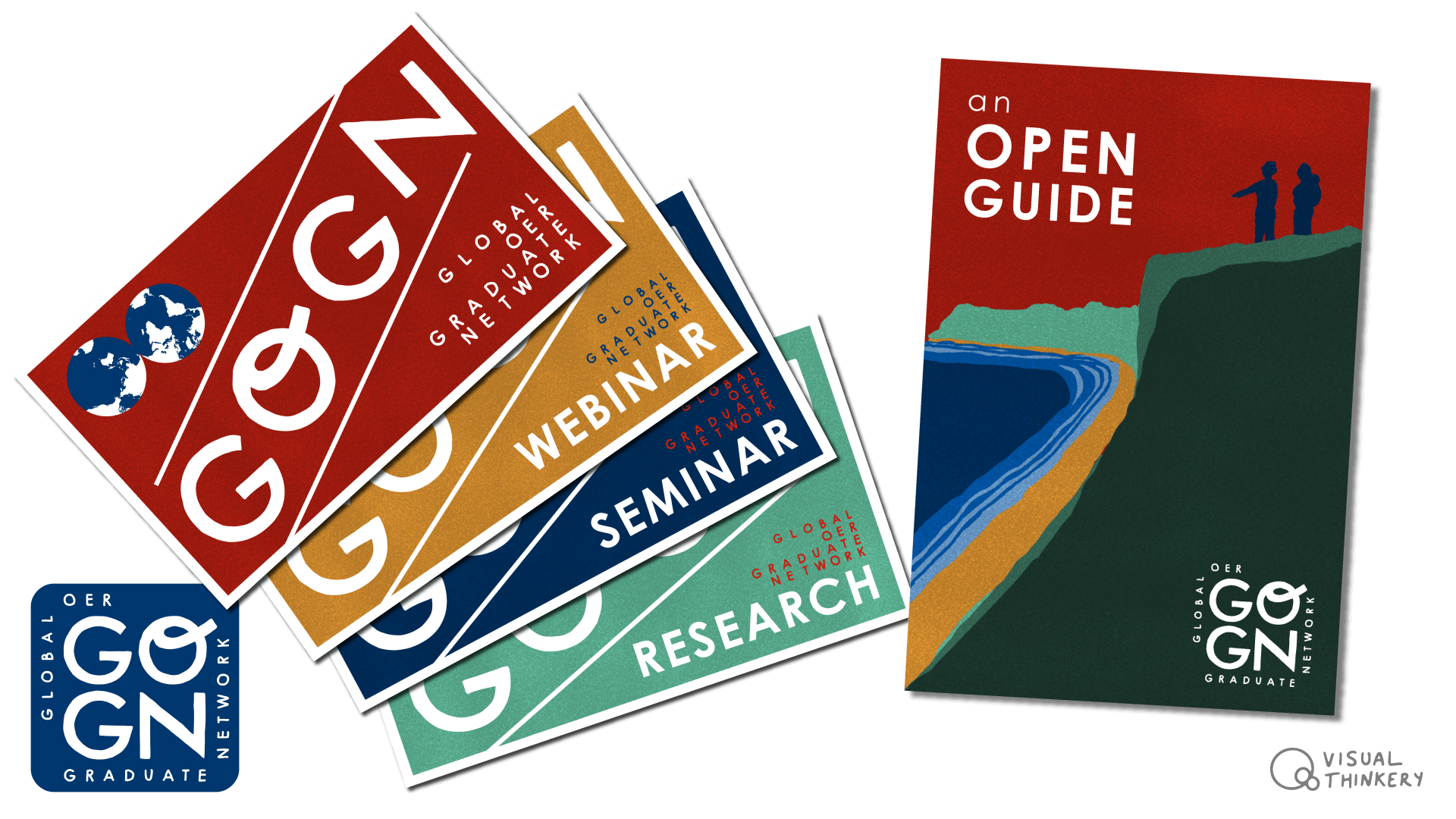
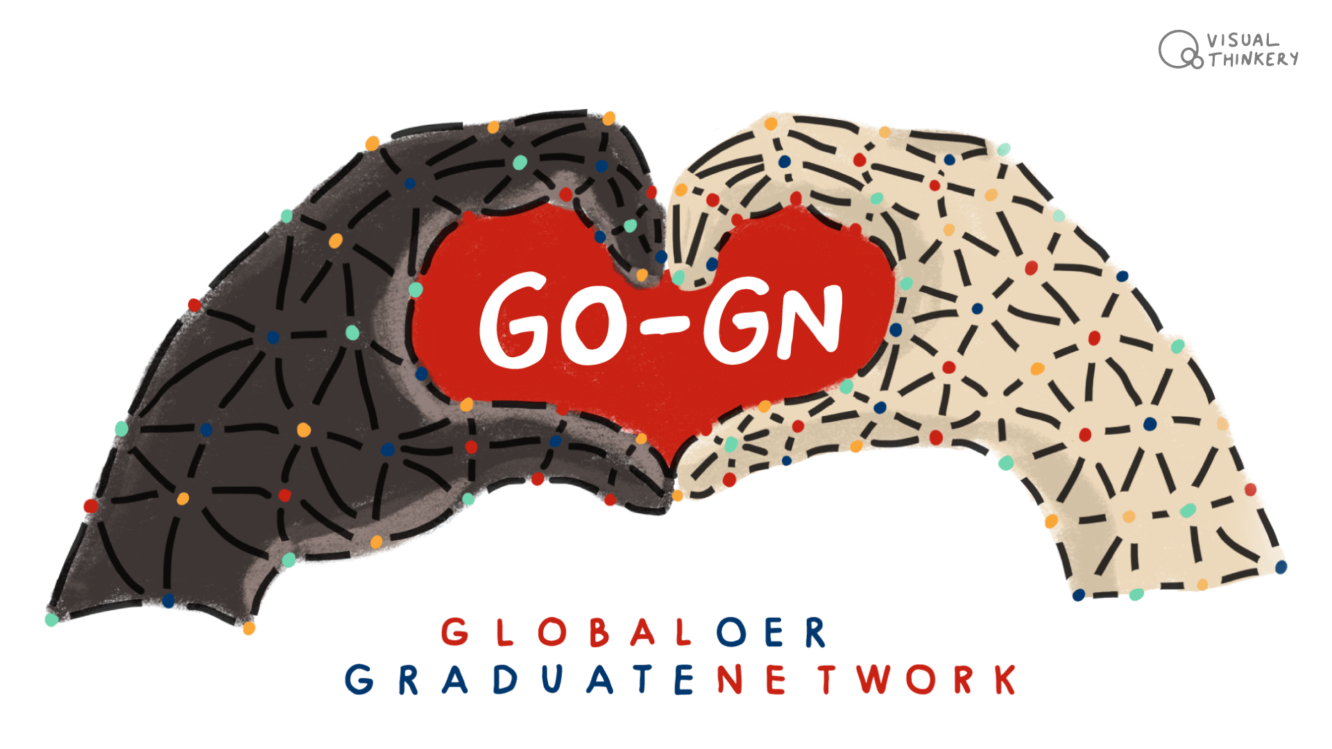
After revisiting the projects completed in the last year, I attempt to group them into separate stories:

I then wonder if I could create a service map that might make sense to someone visiting the Visual Thinkery site for the first time.

Clear as mud? This is, as ever, a half-baked work-in-progress. In fact, this whole operation is a half-baked work-in-progress. But then again, I wouldn’t have it any other way…
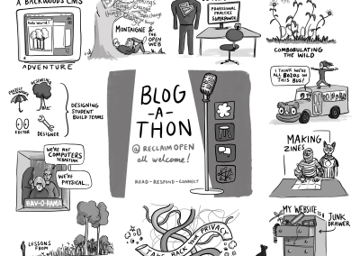
Read next
Here are some other projects you might be interested in.