25 Years of EdTech

25 Years of EdTech - Cover

25 Years of EdTech

Martin Weller, Professor at the UK’s Open University, got in touch regarding the aesthetic for a book he was earnestly applying the finishing touches to – 25 Years of EdTech.

Of course, as Martin knows, the Visual Thinkery process means that together we’ll create 10 book covers, as well as anything else we pick up along the way. This includes even suggesting alternative titles for the book (which is outrageous, when you think about it) but even this creates a different lens to get an alternative glimpse through.  

Interestingly, the first idea was the one that eventually stuck:

25 Years of EdTech - X-ray Goggles


But there are a few others that I think deserve an honourable mention. I was tickled by the idea of a relationship between parent and child (but I want to go this way!

25 Years of EdTech - Ed & Tech


And it’s not long before I’m drawing robots. (And then the world of assessment will be miiiiiiiine!)

25 Years of EdTech - The scaling up of Edtech


I like “The Web Years” as it reminds me of the common biographical strapline (the wonder years, the wilderness years…) and suggests that there has always been some sort of technology in Education, but only recently has it involved the web. Here we go again, here we go go go to the temple of consumption… (apologies – you probably didn’t need reminded of that song…)

25 Years of EdTech - The Web Years


ISDN – Now that will change everything…

25 Years of EdTech - Dodgy Connection


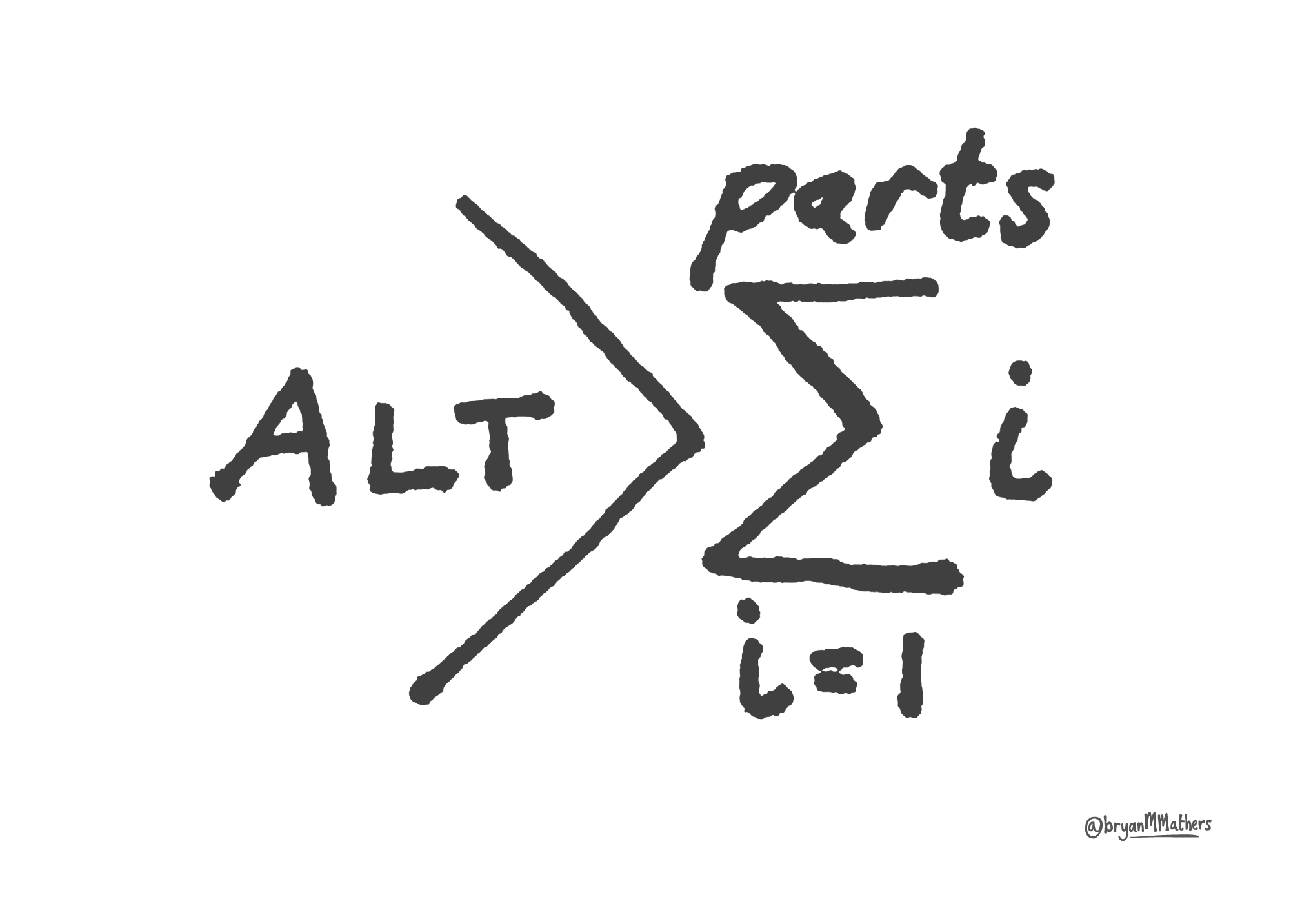
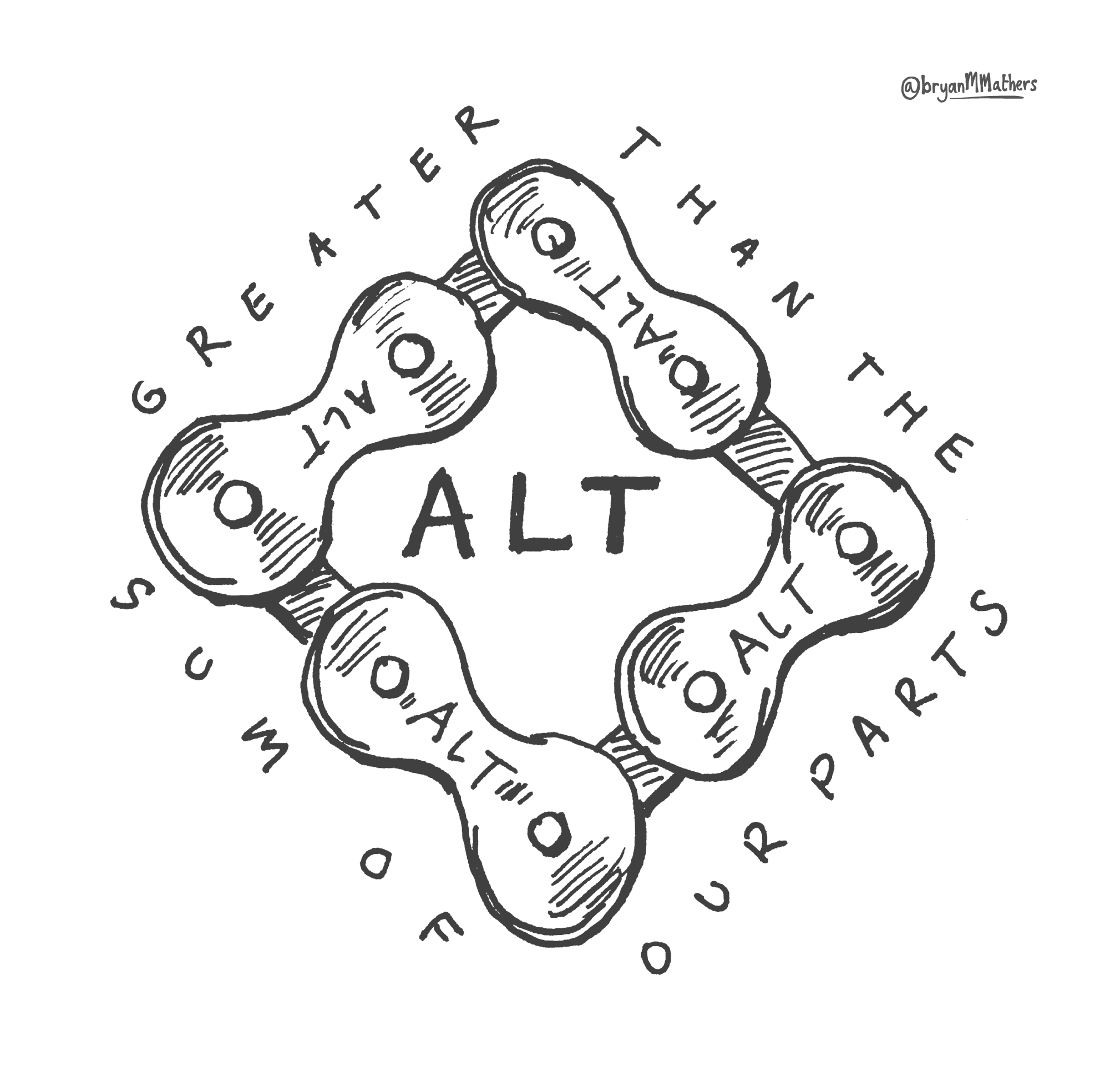
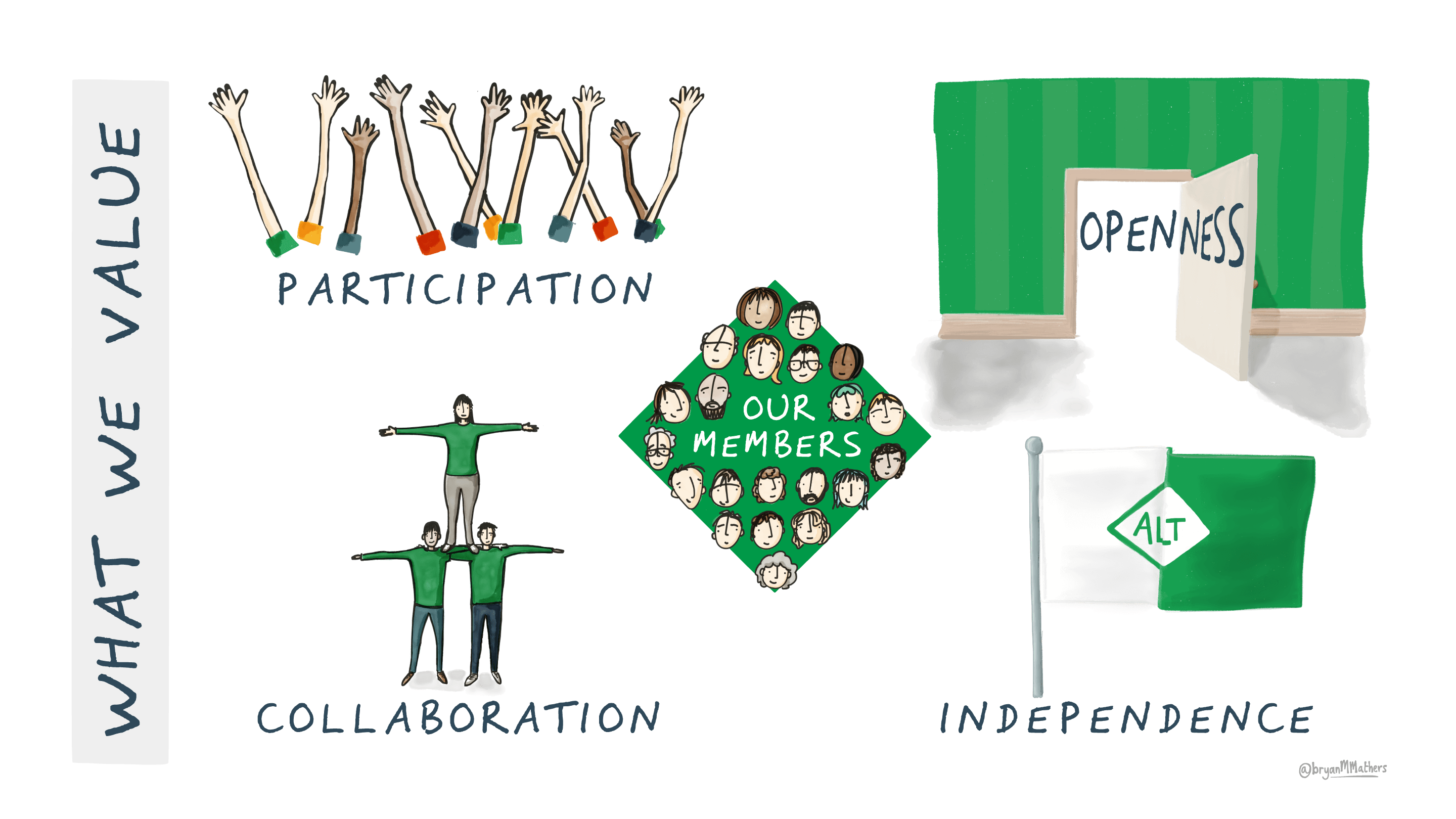
We’re never far from someone taxonomising all the things. But not me – I’m more of an alchemist…

25 Years of EdTech - Alchemist's Handbook


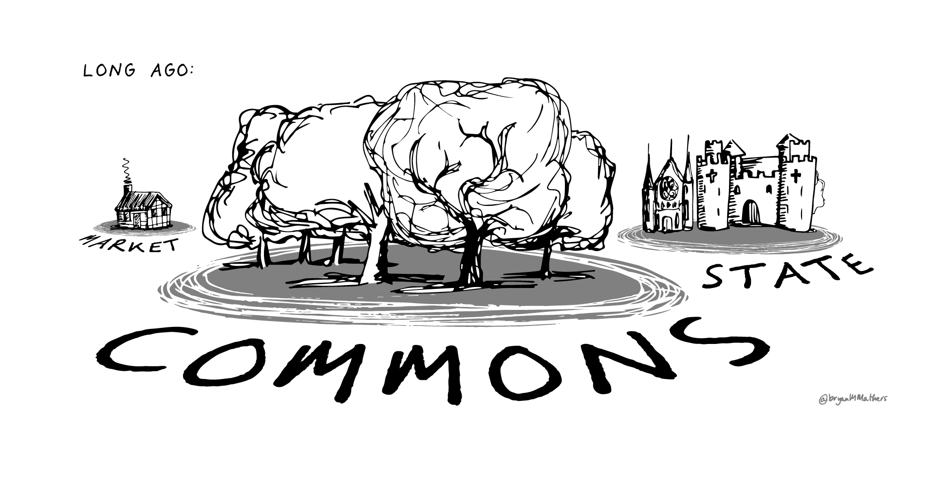
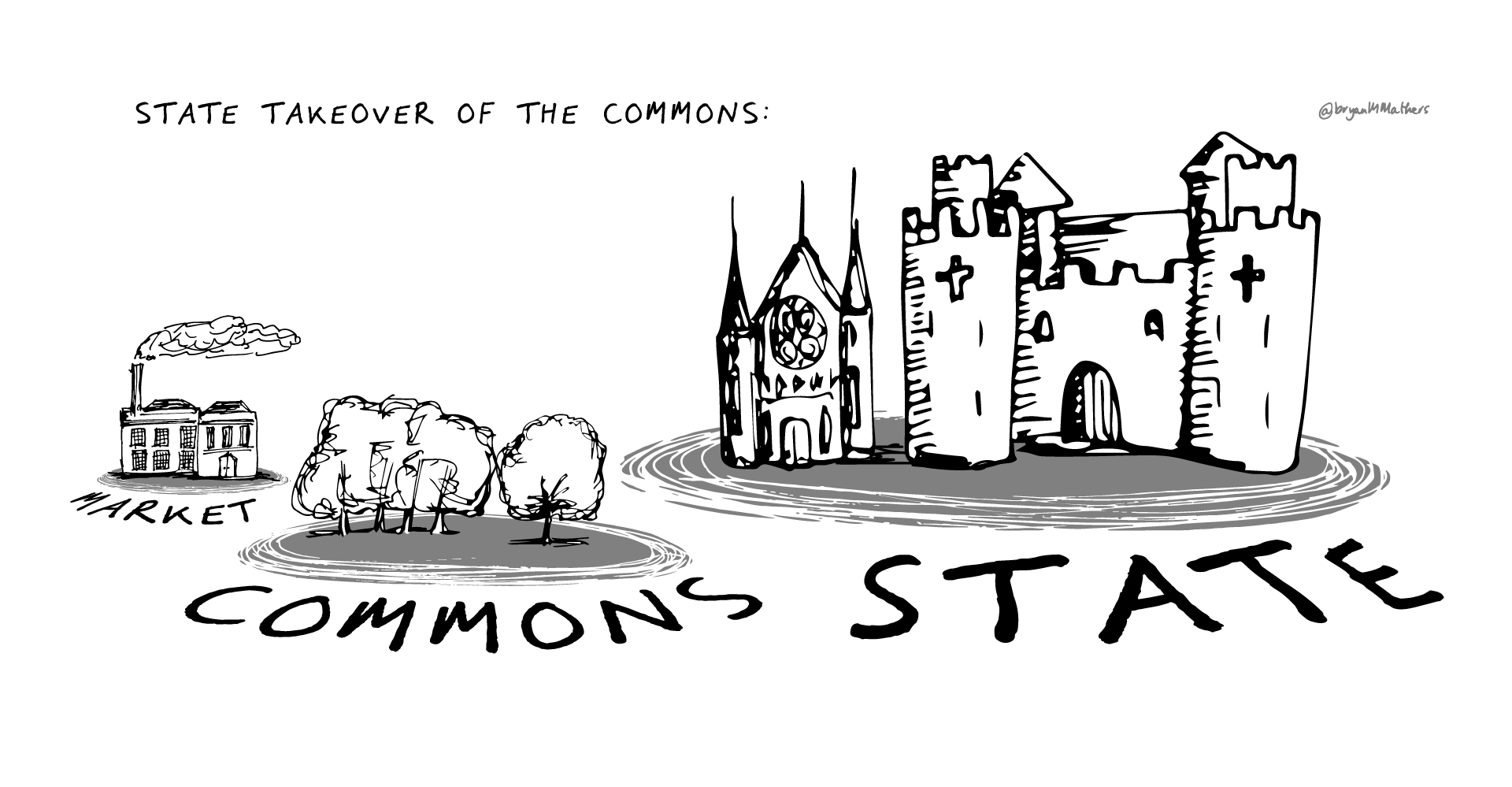
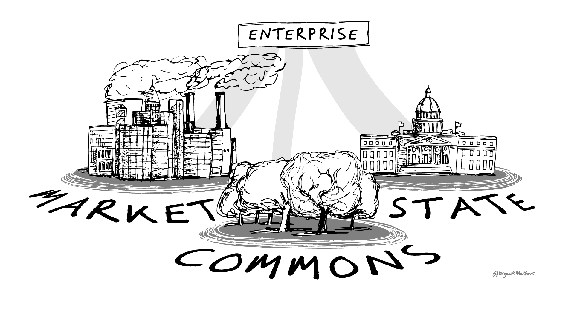
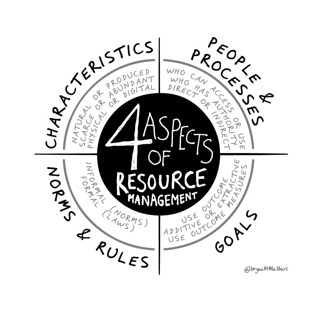
In reflection, there were small elements from a number of these ideas that made their way into the final cover. Some consciously, and others less so.

Now Remix this…

As part of the promotion of the book, AU Press asked if would be possible to create a remixable front cover. So I (Bryan) set about separating the visual elements so that they could be remixed using the Fabulous Remixer Machine. Hair highlights, skin tone, background – but maybe more importantly the text on the glasses and the strapline at the bottom. Have a go!

25 Years of EdTech - Remixer

And Finally…

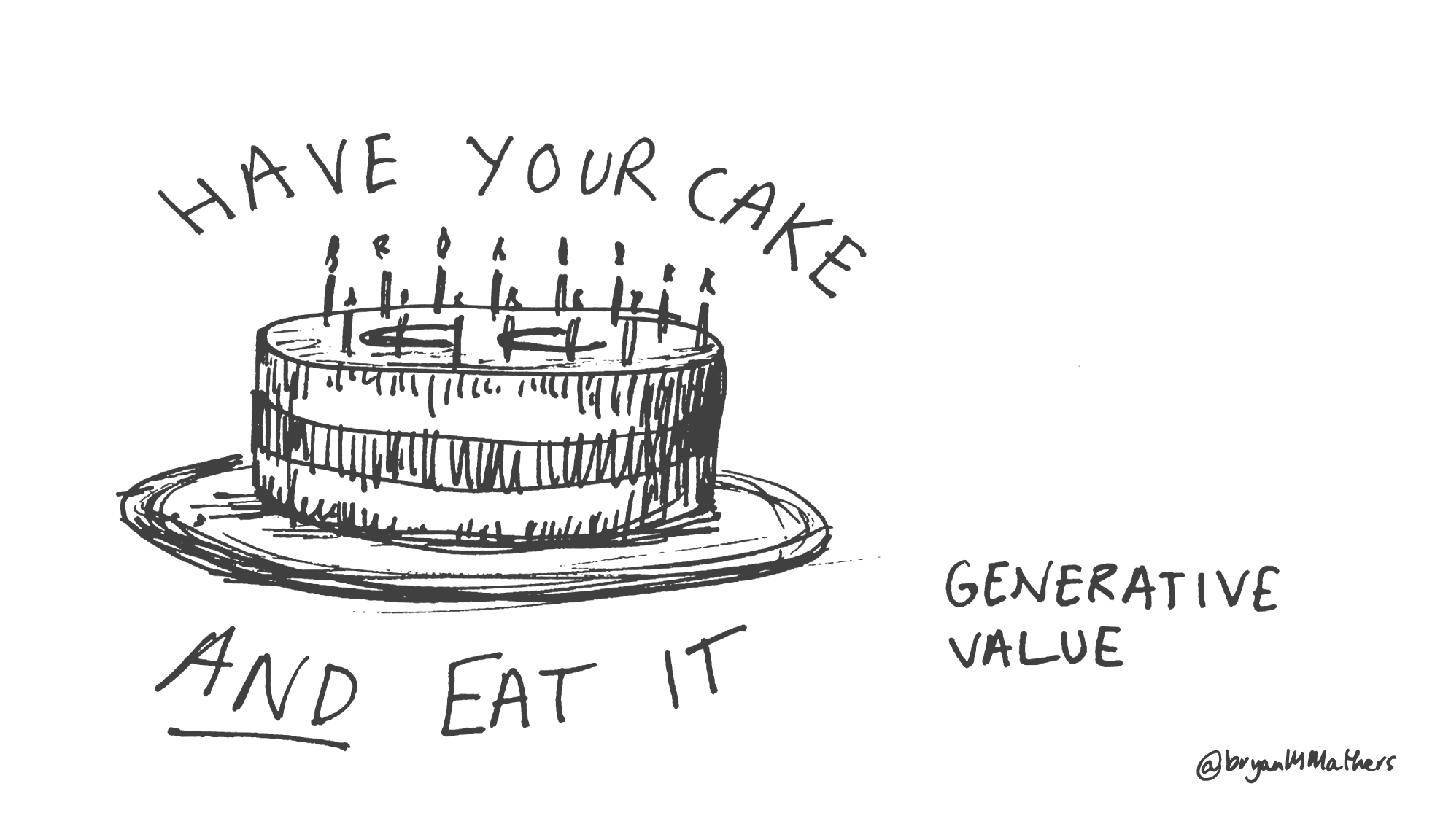
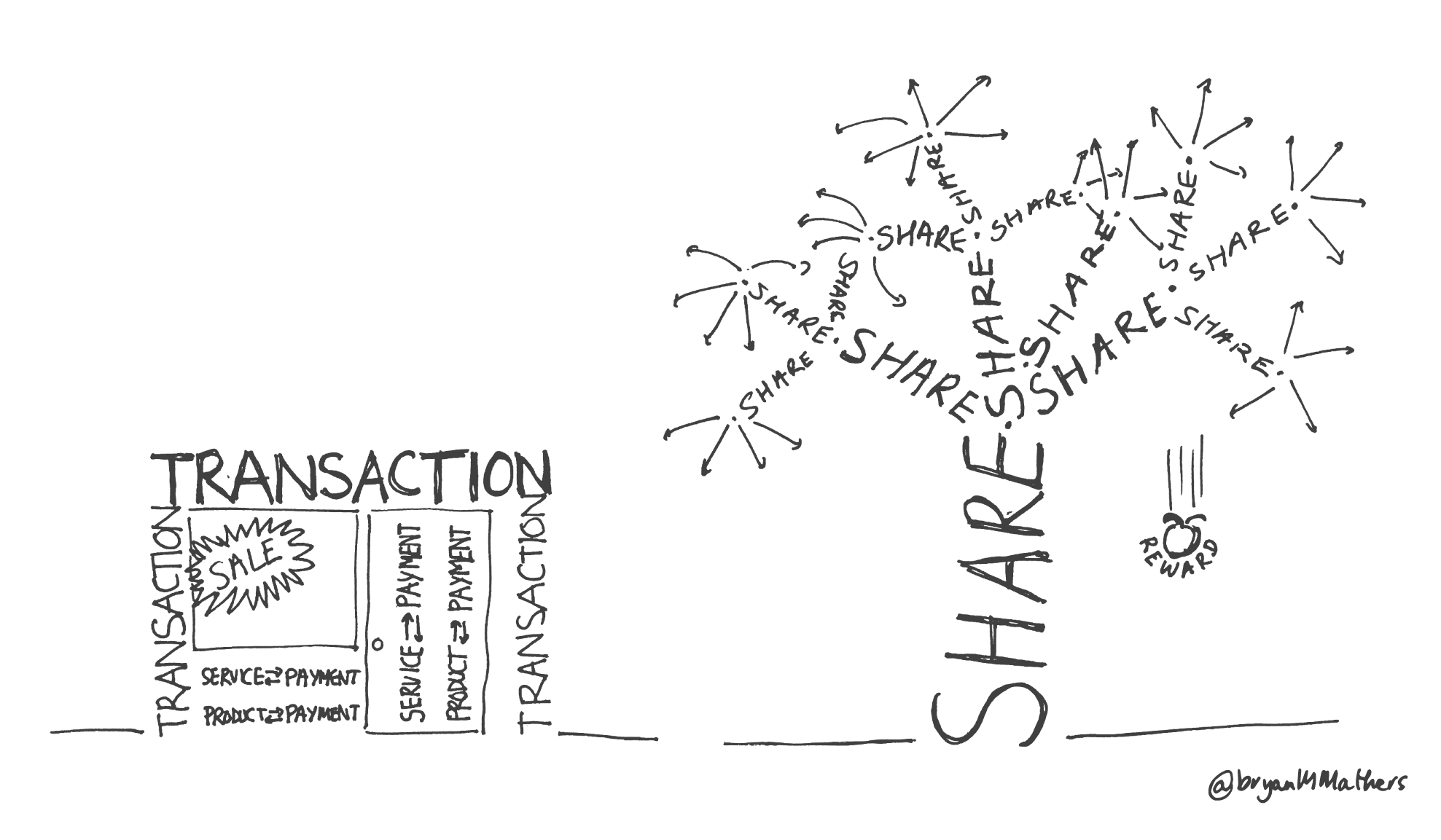
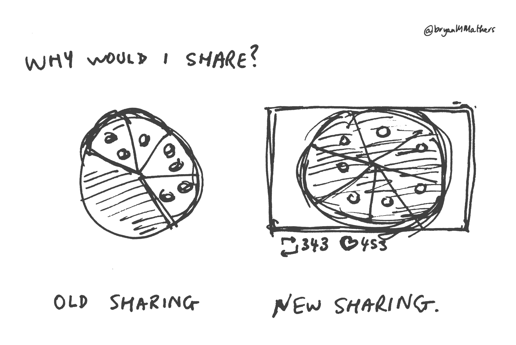
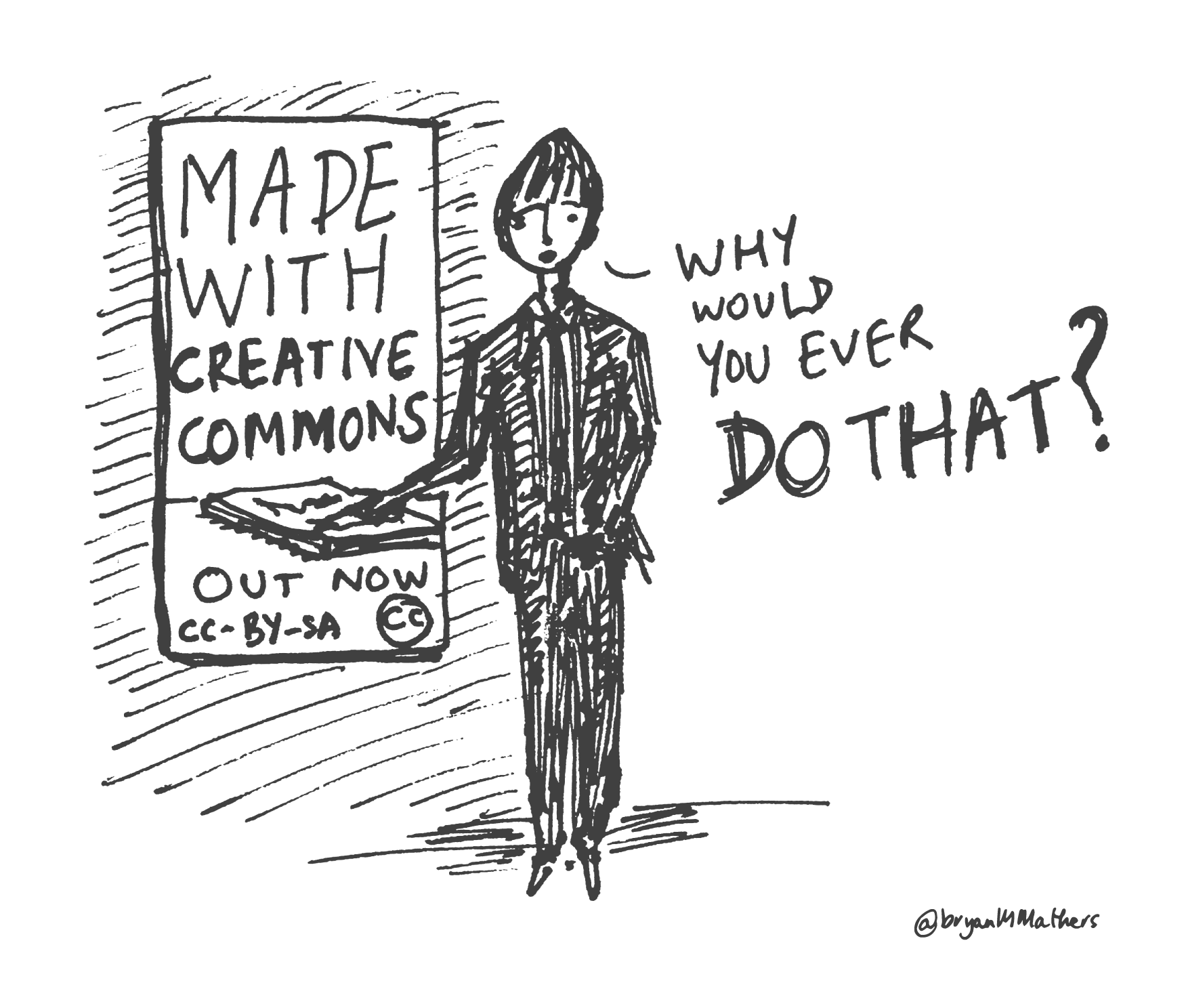
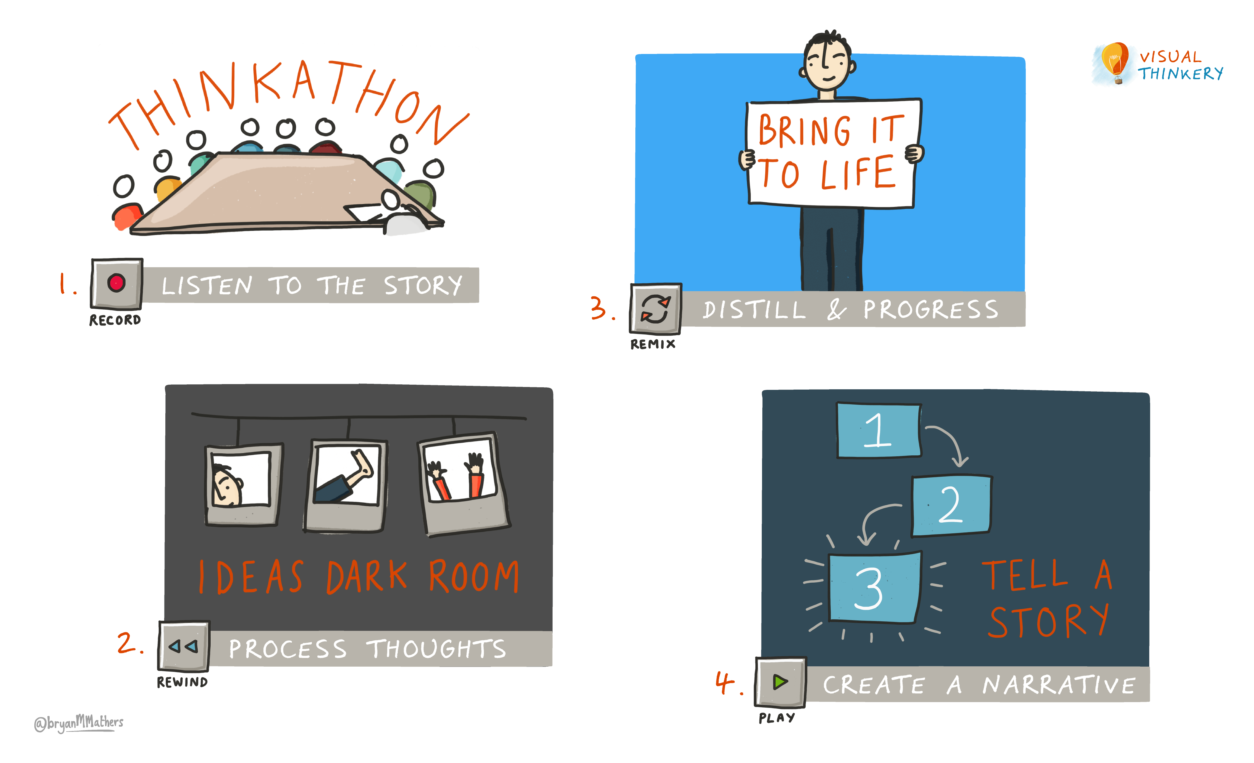
Quite often ideas appear as mini-stories in 3-panelled comic strip format. A couple of these made it into the book. I don’t think it matters what the content relates to, there is always a place for visual humour… 

25 Years of EdTech - Year Zero

GO-GN

GO-GN

I love a wide brief. Getting people together, and using dialogue to see what we can be unearthed. GO-GN is a postgraduate research programme, connecting and furthering those involved in researching Open Education. They asked if I could help with a brand refresh, and create a set of visual assets along the way.

In order to capture all the voices, we took the approach of facilitating two conversations: one for participants and a second for the GO-GN team.

GO-GN Thinkery Conversation
We had two really rich conversations. I live draw while the conversation is taking place, by using a document camera, but also record the conversations so I can go back through them later and harvest and clues I can tune into. 

Ideas

A rich conversation also leads to many ideas. My aim is always to capture as many of them as quick sketches.

GO-GN suitcase sketch

Creating a Visual Language

The trouble is, creating a fresh brand for an organisation is tricky. In some ways it’s like buying a bold new coat. Liking it isn’t enough. You’ve actually got to wear it. What are you as an organisation trying to say? To whom are you trying to say it? If you find an aesthetic that fits well enough, it can be used as a visual language, to communicate a feel which is sub-consciously absorbed. 

One of the prompts in our discussion used a poster-making technique to unearth ideas from the participants on the call. An idea emerged relating to “the golden age of travel”, which led to us nailing down a bold visual language. It’s quirky yet intentional. It has momentum built in.

A quick shout out to the Fabulous Remixer Machine – for providing the necessary inverted earth projections too!  

Listening with your eyes open

Video conversations underpin the Visual Thinkery 10 ideas process. By seeing someone as they talk, it’s possible to hear a richer voice. One of the participants in the call, Caroline Kuhn, used this gesture while speaking of the care and respect that exists in the GO-GN network. And it had to be drawn…

DRS Manifesto

CMALT Core Principles

DRS Manifesto

The team from Zero Waste Europe got in touch about developing a visual aesthetic for a manifesto they had created. Manifesto you say? Yum. But what is a DRS? I’m glad you asked. As I soon learned, DRS stands for Deposit Return Scheme. It involves a product manufacturer charging slightly extra (the deposit) when using a container and then refunding this extra cost on the container’s return. This way, plastic containers can be collected by the manufacturer and reused or at least recycled.

In terms of visual ideas it was obvious that this manifesto would need to educate the reader. So that meant getting visually underneath the explanation of the DRS. I started thinking about what a DRS brand might look like, and by playing around with the letters, I noticed that the R and S could interact in a way that might suggest actions of deposit and return. 

The EU flag is circular in appearance, and therefore lends itself well to saying something about a circular economy. 

I also noticed quite by accident when putting all the partner logos together that they could form the shape of something: a container – a great metaphor for the manifesto itself. We’re all in this together.

After the first draft, the team suggested adding more of a human element to the aesthetic. This is where the idea for the many hands lifting up the containers came from. Suddenly there was a different feel to the manifesto – it somehow became active! The power of the human body to subconsciously communicate.

Overall, the team felt that we’d struck a good balance between professional and punchy, and it’s true – the hand-drawn elements feel friendly and genuine, whilst the typeset narrative feels authoritative. Most importantly, it carries a simple design, and it’s this playful simplicity that disarms the intended audience and allows them to engage with the manifesto and it’s message. 

You can read more about the DRS Manifesto here.

Made with Creative Commons

Made with Creative Commons

Made with Creative Commons

“So tell me what this book is all about…”

I had pinned down Paul Stacey and Sarah Pearson, authors of the Made with Creative Commons book, for a transatlantic online meeting. I was playing the role of the grand inquisitor (well – a friendly, enthusiastic, grand inquisitor maybe…)

And they talked. And I listened; and asked some questions. I was recording our 2-hour conversation so that I could go back through it hunting for clues to an idea: a turn of phrase; a metaphor used; or something that resonated with my own journeys in business.

The name of the game is to sketch up as many ideas as possible – to see which ideas resonate. Having listened to Ed Sheeran on Desert Island Discs recently, he talks about a similar approach to making his music – he picks up his guitar and gets on with writing 4-5 songs in a day, and maybe 100 for an album – selecting the best ten for the album itself and putting the other ninety on the shelf. Go wide; see what resonates.

The more I learn about the Commons, the more I see myself as a commoner. With software businesses, I’d grown up with only one way to do business: start-up, get investment, scale up, exit. Of course, an Open Source model turns this on it’s head. Try to explain this to business executives, and they’ll look at you like you’re speaking a foreign language…

Here’s some of the final artwork created for the book:

You can order a print copy or download a free digital copy of the book by going to the Made with Creative Commons page.

As for me, I couldn’t resist bringing the cover to life…

ALT – A visual strategy

CTRL-ALT-CREATE

No-one would set out to create a visual strategy. But now that I’ve facilitated the creation of one, it seems such an obvious way of engaging the troops and gathering alignment, creating something that is both of the people and for the people.

Values
Maren Deepwell, CEO of ALT invited me along to a meeting of the trustees in order to visually explore the organisation’s values. Now, many of us have been exposed to values in the corporate sense – culture targets inflicted from above intended to gel an organisation together. It’s of little surprise that such a values manifesto is treated with scorn by those who are supposed to live it out, even if they hold those very values in spades.

As is the way with charities, the trustees of ALT are not paid, so each trustee has a bunch of reasons why they give of their precious time. Some perhaps are obvious, but some are much less so, regardless of which, once a trustee, no-one ever asks. So in this case, the values we explored were more character alignments – and so where better to start than asking: why are you a trustee of ALT?

The Thinkathon
Capturing this facilitated discussion live using pen, paper, document camera and projector, allowed us to see the gems as each was uncovered, some of which resonated deeply with the group. Being external, I could contain the extroverted voices and bring out the introverted ones, as well as sidestepping any politics in the room. And as people talked, they got excited…


The Ideas Dark Room
Capturing a conversation leaves no time for taking ideas further – so I am always keen to drag the remnants from a Thinkathon into the Ideas Dark Room (my shed) and progress them further. The richer the conversation, the easier this part of the process is – but ideas can come from anywhere: a funny thing you notice, a subconscious metaphor with a hand gesture, an off-the-cuff comment after the session… There are questions to ask the page, and puzzles that are asking to be solved.


Bringing it to Life

I gathered up the sketches and sent them through to Maren and later we talked them through with some of her team. The ALT team had been working with their membership on the organisation’s draft 3-year strategy. Maren asked whether we could use the visuals from the Trustee conversations to give the strategy a feel – an aesthetic. What’s the format that will engage most members? It’s probably the same format that will engage the most yet-to-be members too…


Telling a Story
And so, this becomes the primary challenge for visual thinkery; can we:

  1. ENGAGE: create something that people can get the gist of quickly
  2. SHARE: create something that people can make some noise with
  3. OWN: create something that people will tattoo on their laptop…

What we ended up creating really resonated with both members and non-members alike – but if you ask me, it was always going to. This is not magic – it’s artwork and aesthetic that’s rooted in a collaborative conversation.

If you want to have a closer look, here’s the published version in a presentation format designed to be delivered by any member.

Say Hello!
If you'd like to talk with us about a project, we're all ears!