OER24

OER24 Logo and Strapline

OER24

Phew! I’m just back from Cork City, Ireland, having spent a couple or three days at the OER conference. OER is my favourite conference. Not only is it a chance to catch up with a bunch of Visual Thinkery clients – who I usually only get to see online – but the people that attend this conference are people-people. They care about care. They talk about social justice in their work. They are educators, passionate about what they do. So it’s such a treat to have a few days to hang out and absorb their warmth.

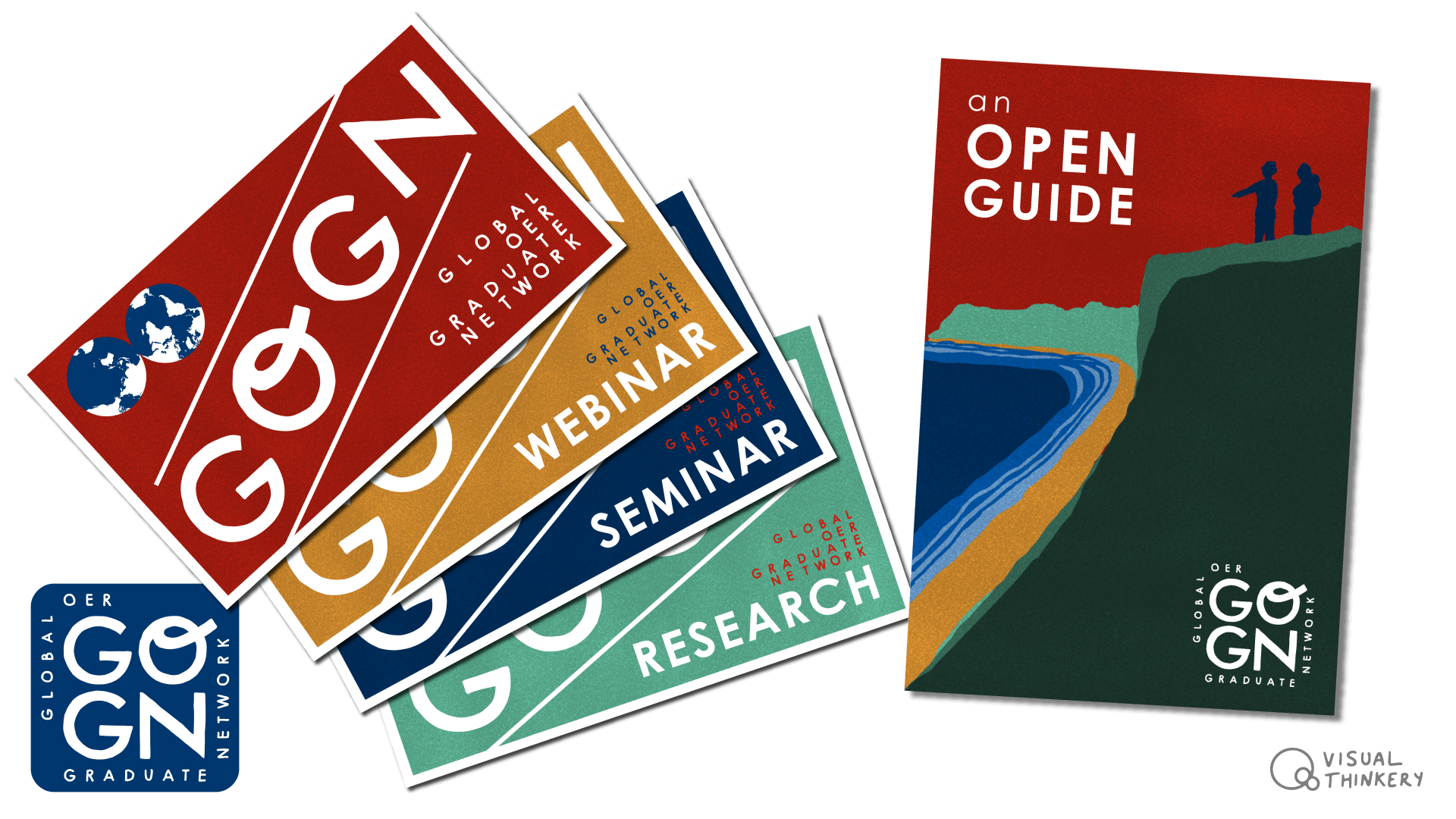
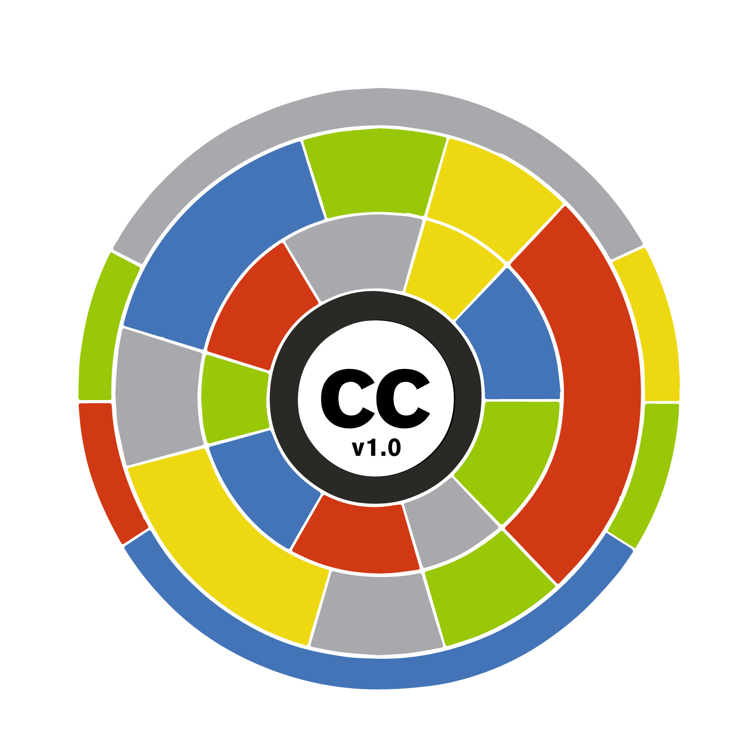
An Open History of the OER24 logo

I had run through the Visual Thinkery process with the conference organisers a bunch of weeks beforehand. From that emerged a freehand aesthetic for the conference including a bright and bold logo.

I’d leaned into a part of our creative conversation about Celtic Ireland being an ancient seat of learning – famous for its deliciously illustrated texts such as the Book of Kells.

At the conference, a few people told me how much they liked the logo. So I thought I’d create a quick stop motion video exported from Procreate (my iPad drawing software) illuminating part of the drawing process of its evolution:

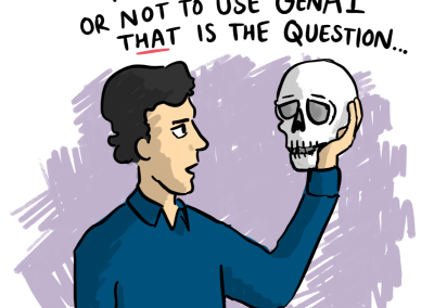
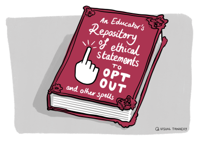
A little humour goes a long way

When having creating conversations with clients, I’m always listening out for little golden nuggets of humour, as they often make great cartoons. A lot of AI-related chatter permeated the conference, and I found myself jotting down a few ideas for future AI related cartoons (if I ever get around to bringing them to life). The cartoon below came from the same creative process as mentioned above and is already a favourite of mine:

Generative AI and Pesky Ethics
Pesky Ethics - by Visual Thinkery CC-BY-ND
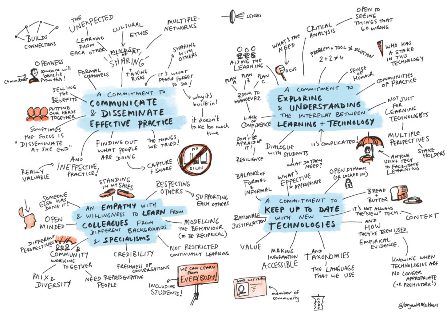
Keynote #1

I sat down to capture the first day’s opening keynote by the lovely Rajiv Jhangiani in a sketchnote form. Sketchnoting is extremely intensive as whilst drawing one thing, you need to listen out for the next thing to draw. On the other hand, the creative constraint of capturing meaning before it disappears means that there is no opportunity to overthink it. Did I mention I tend to overthink things? 

Fairytales and Dystopian futures - Rajiv Jhangiani - oer24
Fairy Tales and Dystopian Futures - by Visual Thinkery CC-BY-ND
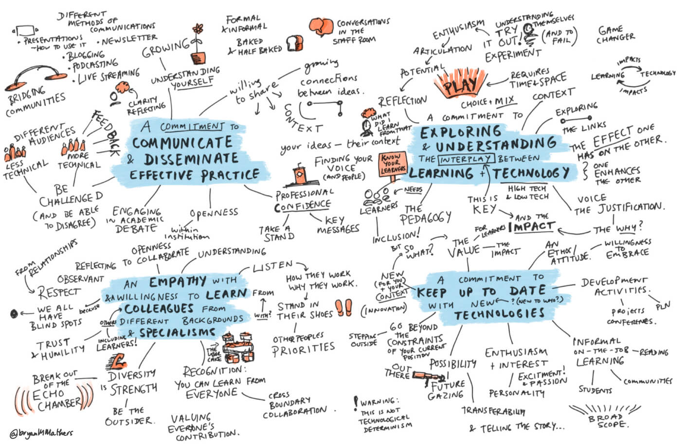
Keynote #2

The second keynote was completely different. Catherine Cronin and Laura Czerniewicz were co-presenting. There were interactive elements which provided useful breathing space for me to catch up on the drawing.

Open Education at a crossroads - Catherine Cronin and Laura Czerniewicz - oer24
Open Education at a Crossroads - by Visual Thinkery CC-BY-ND

Keep on running

I managed to get myself up for a 10k run on the morning of the second day (I’m running the London Marathon – eek! – you can sponsor me here) I ran along the banks of the river Lee on a cool sunny morning. All the way to Blackrock castle and back. It seems I have more exploring to do around that part of the world, and find out where it gets it’s rebellious reputation… 


OER24 Themes Postcard
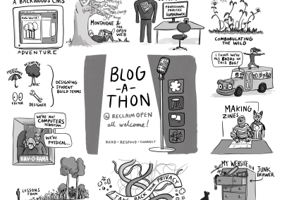
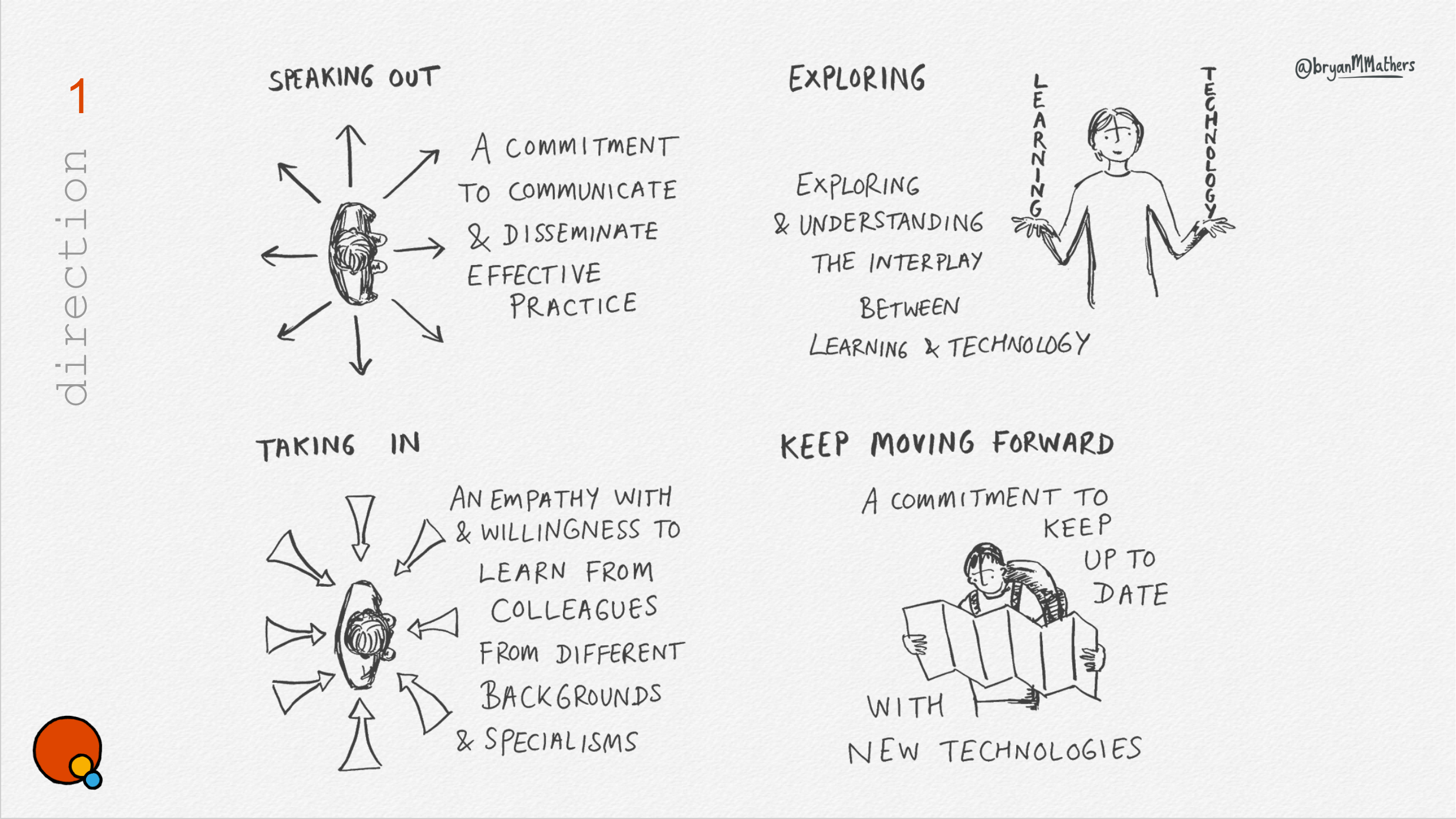
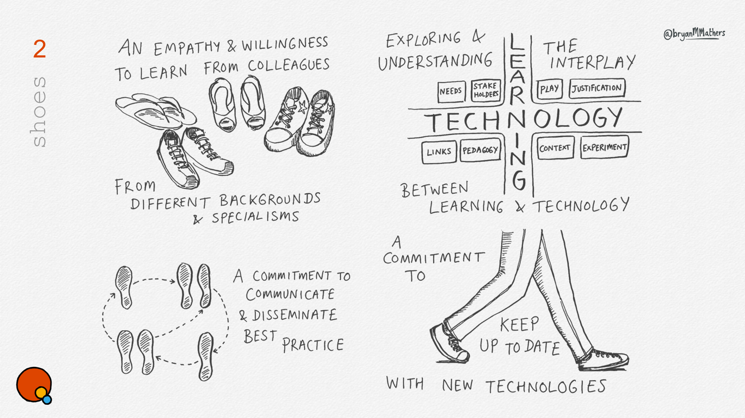
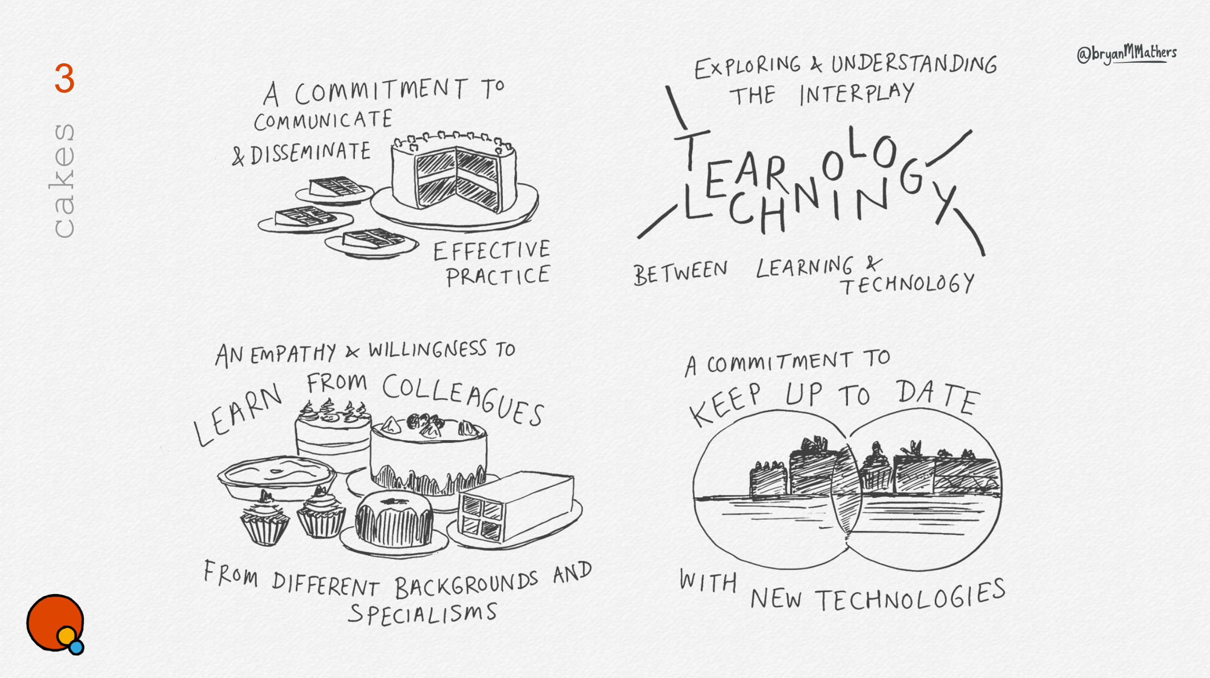
OER24 Themes Postcard - by Visual Thinkery CC-BY-ND

And finally

I leave Cork with lots to think about and some new avenues to visually explore. A conversation over coffee with Maren Deepwell, Meredith Huffman and Alan Levine about conference formats sticks in my head. We hit upon the Upside Down Pear Cake conference format, where each session starts with the conclusions first, then gathering questions, spending the remaining time answering and explaining how they got there. Maybe a thought for next year’s OER25… 


OER24 Logo and Strapline - transparent
OER24 Logo - by Visual Thinkery CC-BY-ND

GO-GN

GO-GN

I love a wide brief. Getting people together, and using dialogue to see what we can be unearthed. GO-GN is a postgraduate research programme, connecting and furthering those involved in researching Open Education. They asked if I could help with a brand refresh, and create a set of visual assets along the way.

In order to capture all the voices, we took the approach of facilitating two conversations: one for participants and a second for the GO-GN team.

GO-GN Thinkery Conversation
We had two really rich conversations. I live draw while the conversation is taking place, by using a document camera, but also record the conversations so I can go back through them later and harvest and clues I can tune into. 

Ideas

A rich conversation also leads to many ideas. My aim is always to capture as many of them as quick sketches.

GO-GN suitcase sketch

Creating a Visual Language

The trouble is, creating a fresh brand for an organisation is tricky. In some ways it’s like buying a bold new coat. Liking it isn’t enough. You’ve actually got to wear it. What are you as an organisation trying to say? To whom are you trying to say it? If you find an aesthetic that fits well enough, it can be used as a visual language, to communicate a feel which is sub-consciously absorbed. 

One of the prompts in our discussion used a poster-making technique to unearth ideas from the participants on the call. An idea emerged relating to “the golden age of travel”, which led to us nailing down a bold visual language. It’s quirky yet intentional. It has momentum built in.

A quick shout out to the Fabulous Remixer Machine – for providing the necessary inverted earth projections too!  

Listening with your eyes open

Video conversations underpin the Visual Thinkery 10 ideas process. By seeing someone as they talk, it’s possible to hear a richer voice. One of the participants in the call, Caroline Kuhn, used this gesture while speaking of the care and respect that exists in the GO-GN network. And it had to be drawn…

Creative Commons

Creative Commons Certificates

Creative Commons Certificates

Following a thinkathon with some colleagues from We Are Open Co-op, Creative Commons asked if I’d help them with the aesthetic of their certification programme, which was then in it’s infancy.

Dialogue

We arranged a session online with Creative Commons staff, and went sniffing for anything that looked like an idea. From abstract shape, to physical metaphor, we captured everything – believing that when played back to the stakeholders, they would recognise it when they saw it.

Here are a handful of the ideas:

We settled on the orbit idea as the best fit for the visual identity. The CC licencing programme consists of core modules, with differing combinations of optional modules required for each area of expertise – working in Government, working in Education, working in a Library.

Distill

The next step is to create a number of variations on the core idea. Here is some of the final artwork:

Make it move!

This was definately one I couldn’t leave alone. Those balls needed an orbit! In truth, I created a basic animation in order to create the 2D version of the logo, so taking it further using Adobe After Effects and making an animated gif wasn’t too much trouble.


CC Certificates Animation

CMALT Principles

CMALT Core Principles

CMALT Principles – a visual language

I always love working with ALT members. Openness is baked into whatever they do, so if I’m trying to capture ideas from dialogue, there is no shortage of members to get involved.

ALT asked if I would help them create a visual language for their CMALT programme, starting with the CMALT core principles.

Dialogue

ALT helpfully organised two remote dialogue sessions (using Google Hangouts), in order to involve a range of people in the collaborative process. Taking each of principles in turn, we discussed members’ understanding of each principle’s meaning and captured it using a live drawing method.

Here are the outputs of both sessions:

As you might spot, different voices produce a different conversation. Principles tend to have a degree of constructive ambiguity, resulting in multiple aligned but varied personal meanings. Of course, the more angles you can view an abstract principle from, the more chance of finding a visual metaphor that might fit.

Distill

The next step is to take those rough ideas and create a number of distilled ideas. This process culminated in the following three routes:


Artwork

The rough sketches allow us to see which of the ideas resonate, and how we can take them further.  In the end, we settled on a mash-up of two of the routes. Here’s the final artwork:

Using a visual language to articulate the core principles of our professional accreditation scheme has had real impact: candidates are now much clearer about what the principles are, more advocates have been able to use the artwork to promote the scheme and there is a stronger visual and strategic connections between this and the overall vision of the Association.

Maren Deepwell

CEO, ALT

Say Hello!
If you'd like to talk with us about a project, we're all ears!