BFFP – Gloves and Masks

BreakFreeFromPlastic – Masks and Gloves
I’ve seen them on the streets around where I live. Discarded surgical masks that no-one will touch. Encouraging others to see the impact this has on our environment is no easy task.
As always with the Visual Thinkery process, we met as a group to have a facilitated conversation about the issues at large.

I (Bryan) try to catch as many visual ideas as possible. At the outset it’s hard to know what will resonate with the process participants or the audience. Going wide, and creating at least 10 ideas allows us to test and measure what resonates, in order to then improve or combine ideas further.
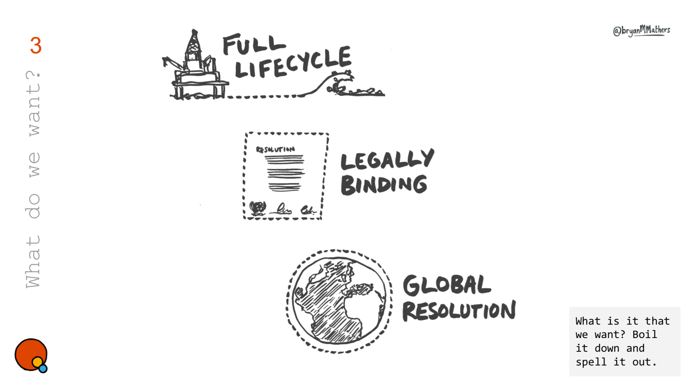
I want a better future
What is the motivation behind the making/buying of a reusable mask. Self preservation probably for most, but what about a sense of hope for the people we share community with?

Sit back and prepare for takeoff…
A strong idea to emerge from the conversation was the aesthetic of Airline Safety Instructions. As a metaphor, it’s very recognisable: “Place over nose + mouth and breathe normally” with lots of opportunity for adding a degree of humour…

Often there is a requirement for multiple translations of the same visual ideas. Also, splitting into engaging chunks for social media campaign engagement.

Look mom, no words…
If there’s a way to talk in pictures without using any words, it’s also worth pursuing.

And Finally
The idea of a “wave” of plastic came directly from the conversation, so by creating a custom brush, we did just that. Find out more about BreakFreeFromPlastic’s Mask and Glove campaign.

Read next
Here are some other projects you might be interested in.