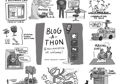
Documentary Cartooning

Aligned Values and Behaviours

Documentary Cartooning

At a recent two-day gathering where I was busily trying to capture insight in cartoon form, a man came up to me and said – “I’ve figured out what you’re doing – you’re documentary cartooning!”. On reflection, he was quite correct. I’m trying to lean into conversations as they arise and when a visual idea presents itself, I grab it with both hands and let it come to life on my page – documented for others to derive meaning from long after the event has taken place.

For the last few years I have been experimenting with different ways of capturing and documenting live conversation as it unfolds. There are a few different techniques. 

The Conversation Landscape

One way to capture the richness of a group’s thoughts or reflections is to live draw the session as it unfolds. The drawing above represents a 60min reflective session where a group of 25 people had previously split up into small groups to think about shared values and behaviours and write their responses on postcards to help with feeding back to the main group. There was a bit of overlap between groups, so as a point was made, it was grouped with others and group’s audible response gave an indication of resonance. 

Output: Gives the feeling of having collaboratively created something meaningful. After the event it’s a great aide-mémoir for those who were part of the conversation, as technically the conversation has been mapped.

Struggle Bus

Nuggets of Insight

When people get together and share in conversation, nuggets of insight appear amidst their words. Metaphors, humour and storytelling all provide clues as to what the insight could look like as a visual expression. 

The “Struggle Bus” example below is a good example of an off-the-cuff comment that resonated with a room full of social entrepreneurs. It tells a story of how hard it can be to get a social project off the ground – but that we can still get there. And it helps to know that there are others on the bus too! Interestingly, as a visual, there is plenty of productive ambiguity in the cartoon. Am I ready to get on the bus? Maybe if I sit beside the right person, they can help me? Different people will add different meaning.

Output: As individual cartoons, these digital assets can have impact long after the event, and inspire people who weren’t there. They can be a useful hook for a blog post and on social media, and can be made available to the participants to use under a Creative Commons licence.  

Thanks SO much again – your thinkery captured the nuance and metaphor of our dialogue as always, and it’s made the follow-up communications a pleasure to do <3

Bex Trevelyan

Platform Places

alt23 sketchnote - Anne-Marie Scott

Keynote Sketchnote

A keynote sketchnote is a visual landscape created live while tuning into a person deliver a presentation, usually at a conference. The example above was created during a keynote by Anne-Marie Scott at the ALT conference.

To me, a keynote feels like a journey. There’s usually a defined theme which flows through the presentation. Some pitfalls and highlights. An opening gambit and a measured conclusion. Often there are visual clues provided by the speaker in the way of slides. The challenge here is to be playful with all of the above, and see if it all can be balanced on a single page.

Output: This form of illustration can be a great way of sharing the “gist” of what someone just spoke about to the wider group who might be connected to the event but weren’t able to attend. 

CMALT Principles

CMALT Core Principles

CMALT Principles – a visual language

I always love working with ALT members. Openness is baked into whatever they do, so if I’m trying to capture ideas from dialogue, there is no shortage of members to get involved.

ALT asked if I would help them create a visual language for their CMALT programme, starting with the CMALT core principles.

Dialogue

ALT helpfully organised two remote dialogue sessions (using Google Hangouts), in order to involve a range of people in the collaborative process. Taking each of principles in turn, we discussed members’ understanding of each principle’s meaning and captured it using a live drawing method.

Here are the outputs of both sessions:

As you might spot, different voices produce a different conversation. Principles tend to have a degree of constructive ambiguity, resulting in multiple aligned but varied personal meanings. Of course, the more angles you can view an abstract principle from, the more chance of finding a visual metaphor that might fit.

Distill

The next step is to take those rough ideas and create a number of distilled ideas. This process culminated in the following three routes:


Artwork

The rough sketches allow us to see which of the ideas resonate, and how we can take them further.  In the end, we settled on a mash-up of two of the routes. Here’s the final artwork:

Using a visual language to articulate the core principles of our professional accreditation scheme has had real impact: candidates are now much clearer about what the principles are, more advocates have been able to use the artwork to promote the scheme and there is a stronger visual and strategic connections between this and the overall vision of the Association.

Maren Deepwell

CEO, ALT

Domains ’17

Domains 17: What are you into?

Domains ’17

Domains ’17 is a conference focused on exploring edtech and other curiosities. It’s also a collaborative partnership between Reclaim Hosting and the University of Oklahoma.

As always, any thinkery work starts with a conversation. During that conversation with Jim Groom, we explored the metaphor of the Record Fair. You never know what you might find there, what gems you might pick up. And who you might meet, some like-minded enthusiasts?

Here are the sketches that emerged from our conversation (mouse over to scroll through):

As with all projects where Jim is involved, I’m always keen to explore new territory. In this case that meant created thinkery with the purpose of animating it. Just one question bounced around my brain: how can I make it come alive? I started thinking about what would be involved in creating a poster that could be animated. Or even just wiggled a bit – to give it a bit of depth…


I was also keen to experiment with mashing up some video footage (taken with my phone) with some hand drawn artwork, to see what effect that would create.


I find it interesting how metaphor-heavy visuals could give you a feel for a conference track, as opposed to just seeing the words in print.

Here’s some more of the final artwork created to bring to life the various tracks of the conference (mouse over to scroll through):


I’m looking forward to see the conversations as they emerge from this conference…

UCL Academy

UCL Academy - An aesthetic logo

UCL Academy

I met the principal of UCL Academy, Geraldine Davies, at an Edu-think event in Westminster, and she invited me to come and spend a day with her students and staff. The brief was to try to capture the essence of the Academy from both a student and staff perspective. In what I think was a brave move, we decided to spend the morning with a range of students, and the afternoon with some of the staff.

We applied visual thinking techniques in order to stand in the shoes of those participating and see from their perspective. As usual, we captured all the thoughts, mostly in the form of sketches and whiteboard photos and presented them back to the principal. A few were selected to be taken to artwork:

It remains the most impressive Academy that we’ve ever visited – especially with regard to their approach to collaboration skills. And yes – how the students saw the school resonated with how the staff saw it…

Making it easier to work harder...
The UCL Academy secret formula

Say Hello!
If you'd like to talk with us about a project, we're all ears!