DRS Manifesto
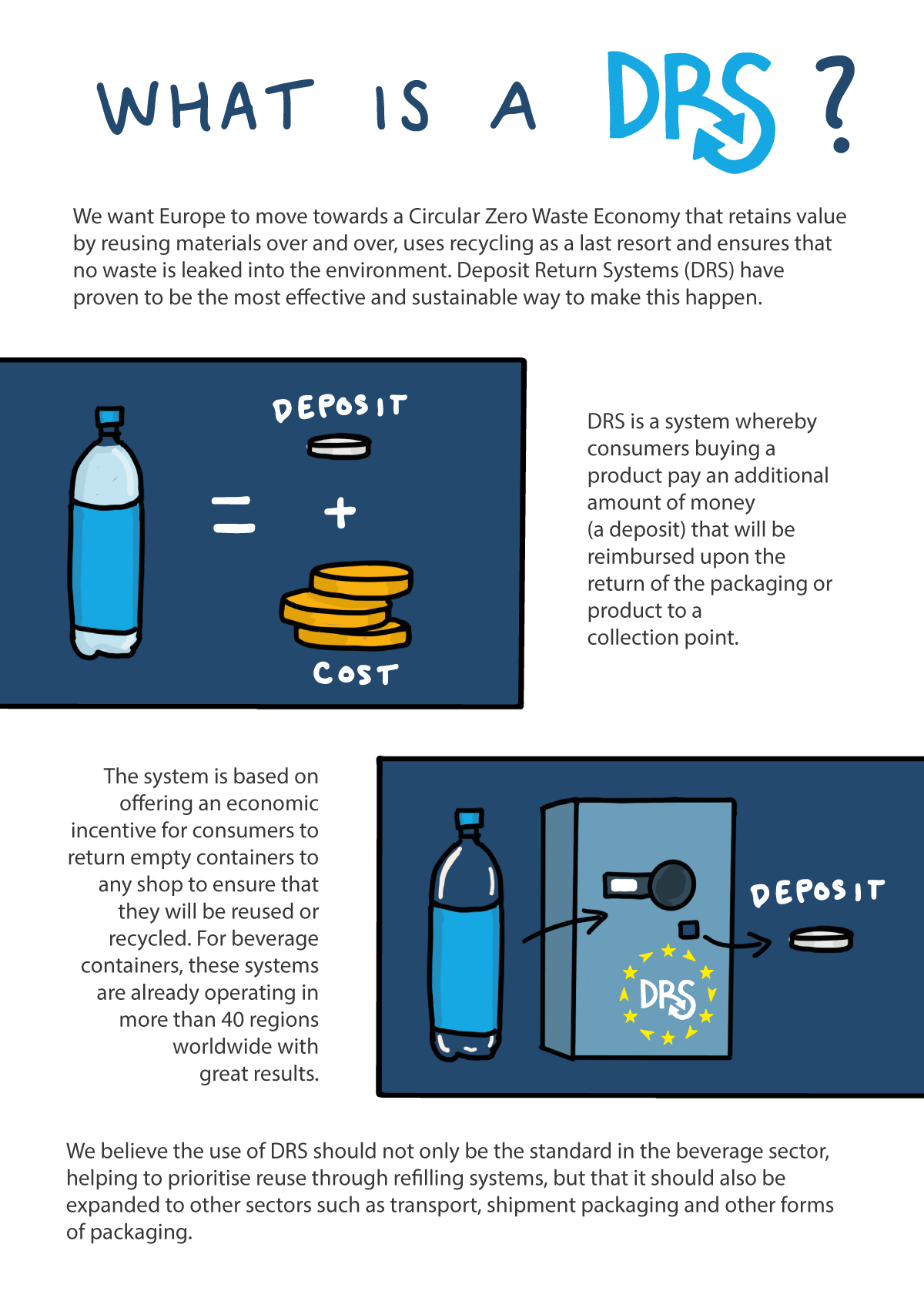
The team from Zero Waste Europe got in touch about developing a visual aesthetic for a manifesto they had created. Manifesto you say? Yum. But what is a DRS? I’m glad you asked. As I soon learned, DRS stands for Deposit Return Scheme. It involves a product manufacturer charging slightly extra (the deposit) when using a container and then refunding this extra cost on the container’s return. This way, plastic containers can be collected by the manufacturer and reused or at least recycled.
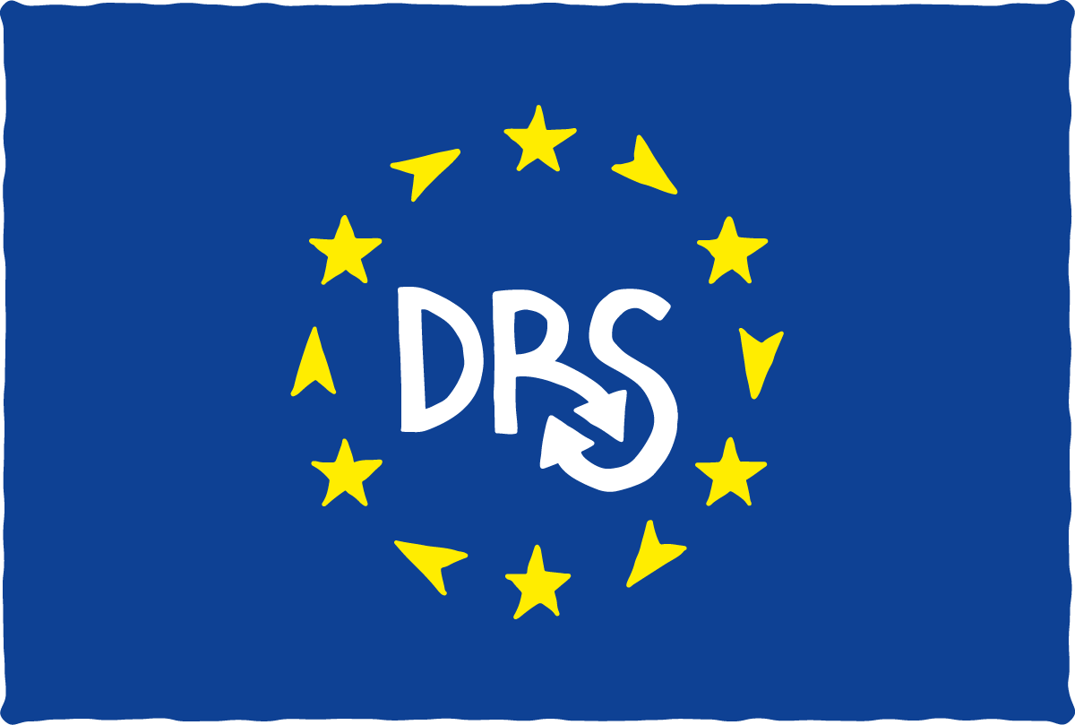
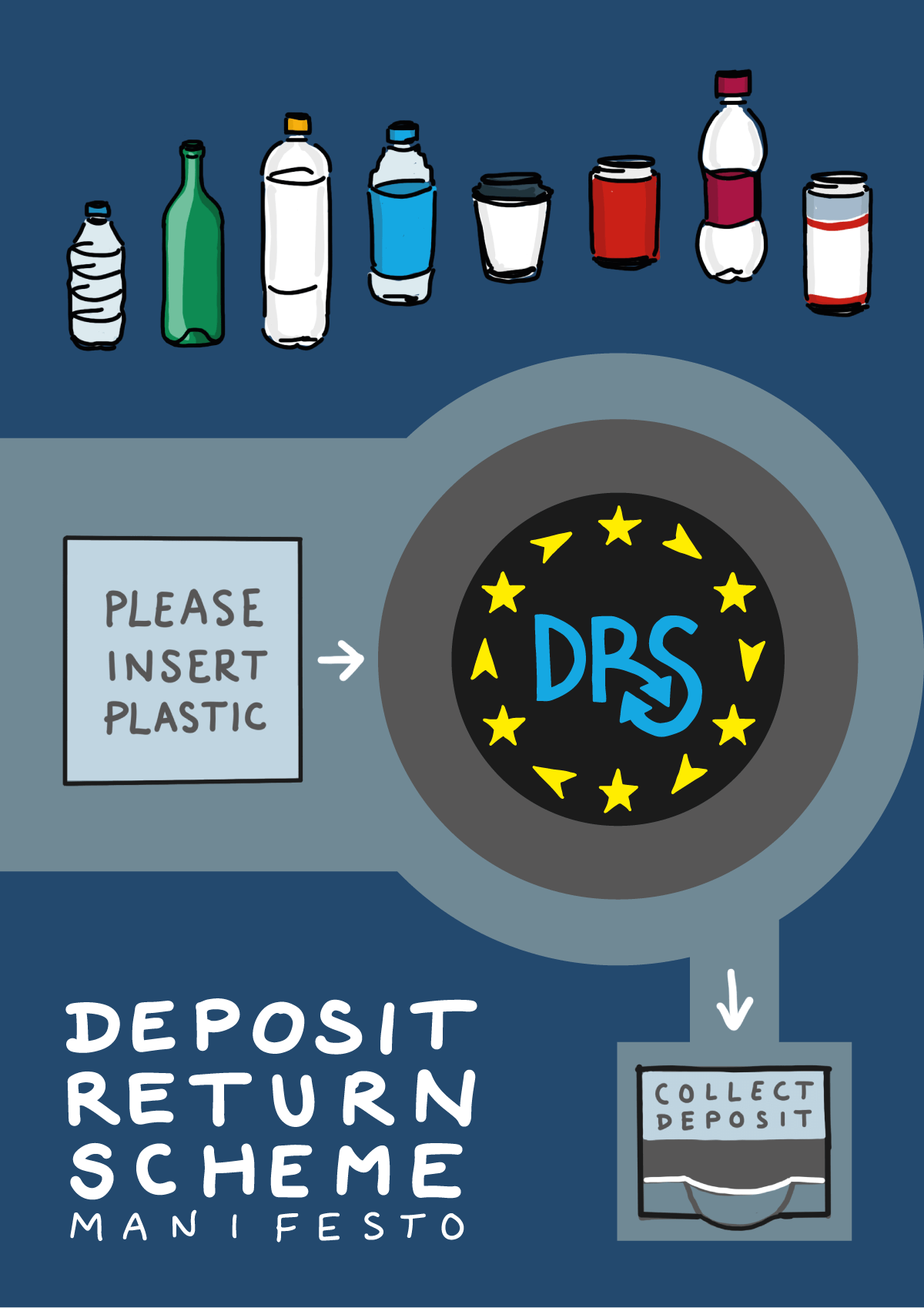
In terms of visual ideas it was obvious that this manifesto would need to educate the reader. So that meant getting visually underneath the explanation of the DRS. I started thinking about what a DRS brand might look like, and by playing around with the letters, I noticed that the R and S could interact in a way that might suggest actions of deposit and return.
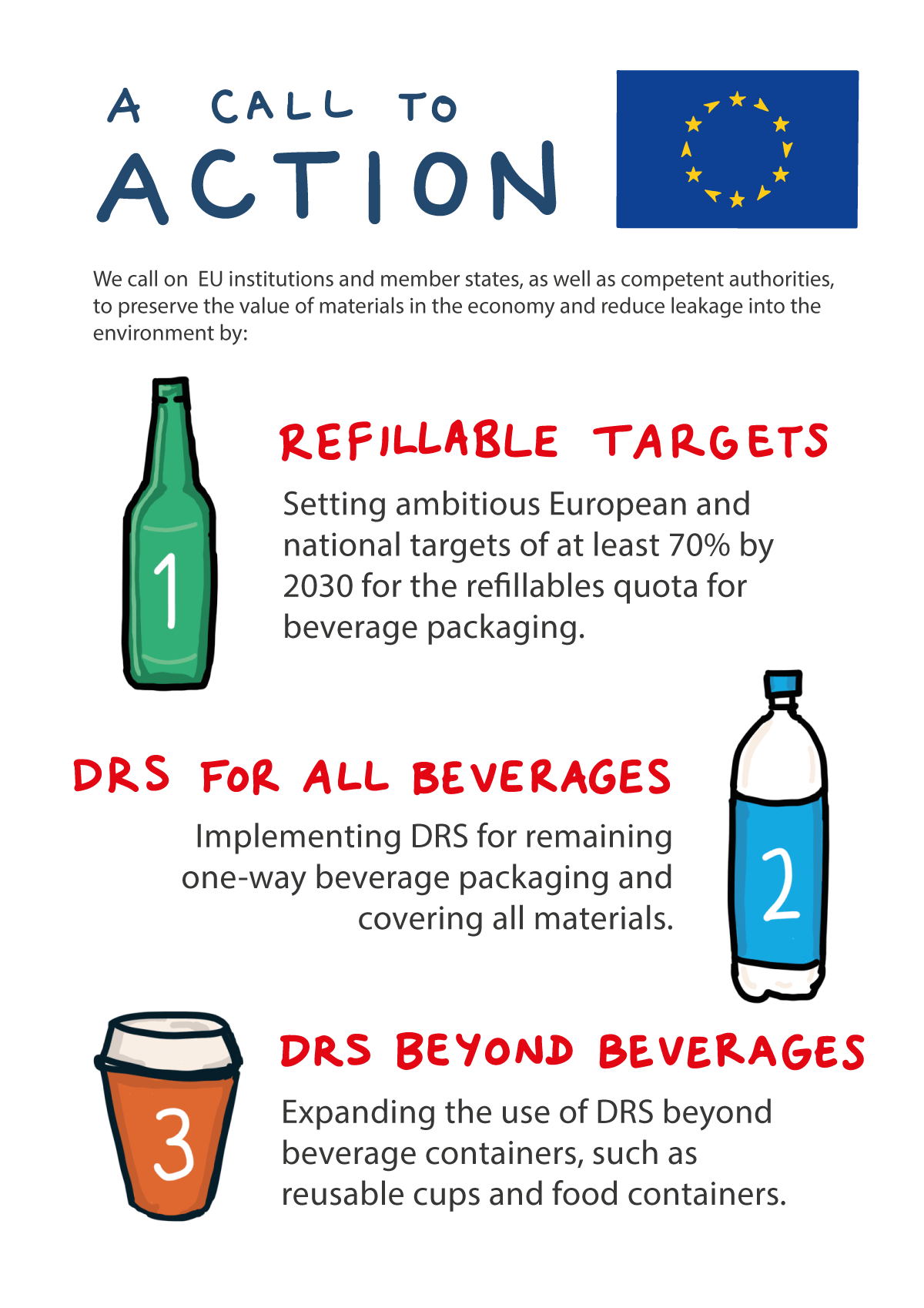
The EU flag is circular in appearance, and therefore lends itself well to saying something about a circular economy.
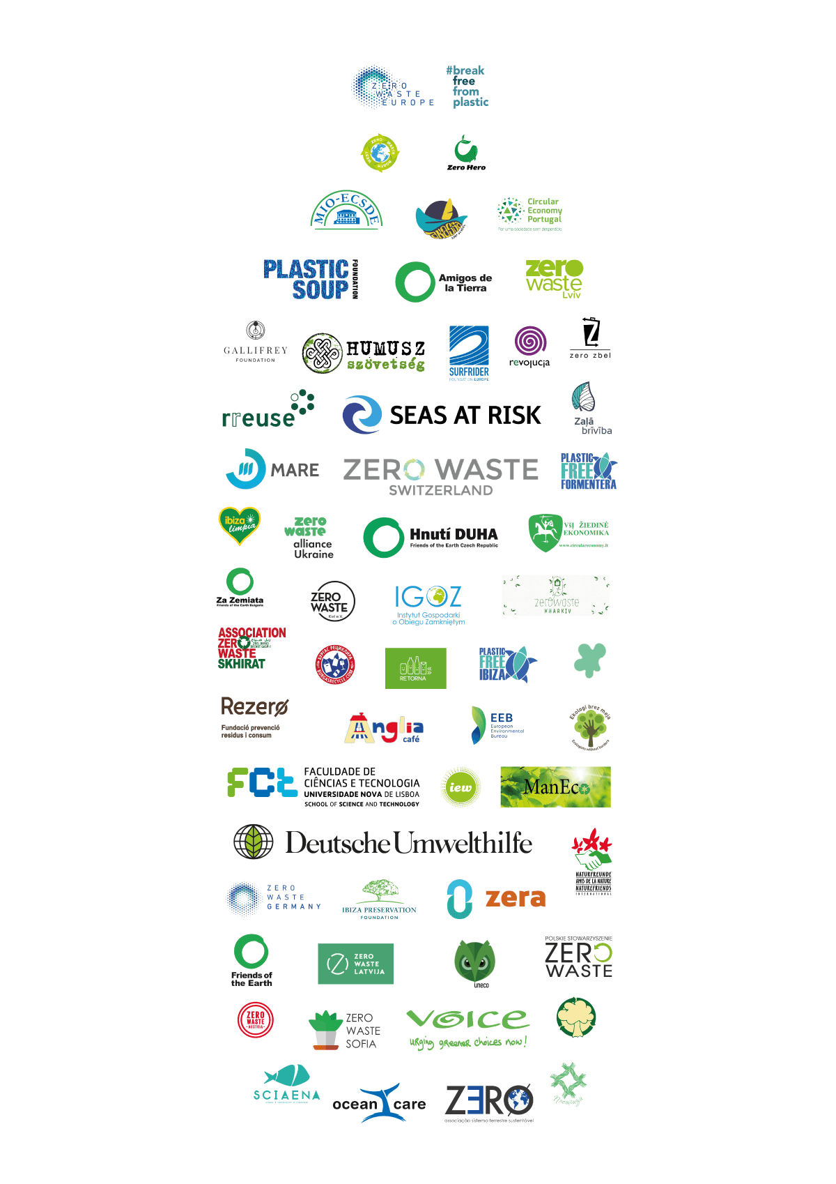
I also noticed quite by accident when putting all the partner logos together that they could form the shape of something: a container – a great metaphor for the manifesto itself. We’re all in this together.
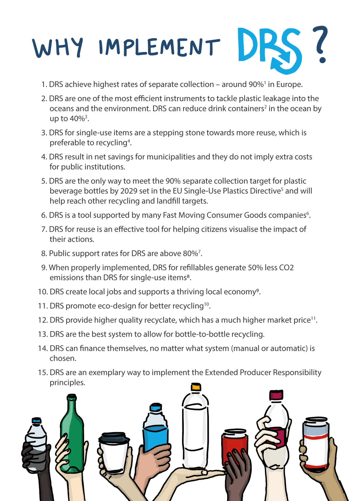
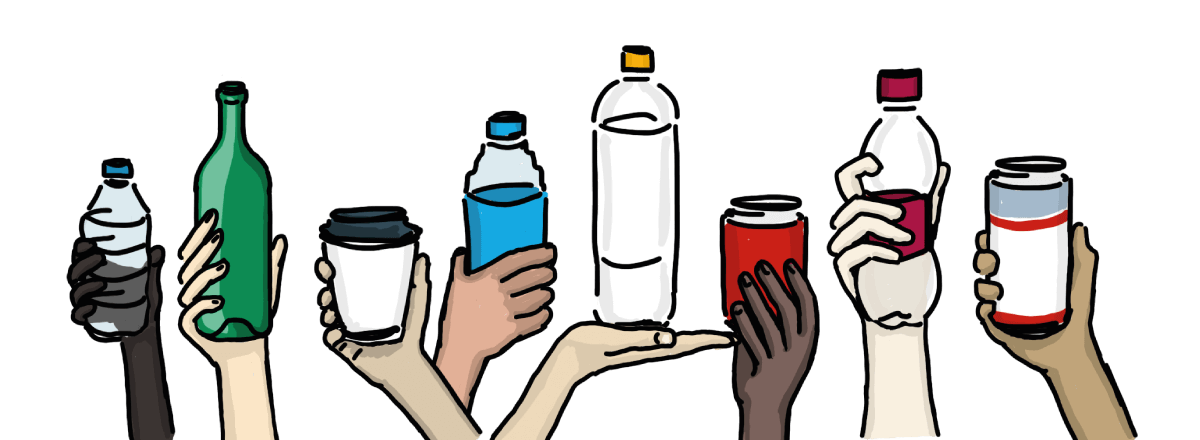
After the first draft, the team suggested adding more of a human element to the aesthetic. This is where the idea for the many hands lifting up the containers came from. Suddenly there was a different feel to the manifesto – it somehow became active! The power of the human body to subconsciously communicate.
Overall, the team felt that we’d struck a good balance between professional and punchy, and it’s true – the hand-drawn elements feel friendly and genuine, whilst the typeset narrative feels authoritative. Most importantly, it carries a simple design, and it’s this playful simplicity that disarms the intended audience and allows them to engage with the manifesto and it’s message.
You can read more about the DRS Manifesto here.
Read next
Here are some other projects you might be interested in.

