Hack Education

The Office of Hack Education

Hack Education

I’d been following Audrey Watters’ Hack Education for a while, mainly because the things that Audrey was pointing out in and around Edtech weren’t very popular with some – but her ability to explore the (or silicon valley’s) narrative of the future with the litter of the past I found to be extremely insightful.

Audrey asked me help explore a new aesthetic for Hack Education, and as always it started with a conversation to capture what it is in her own words.

Here are some thinkery sketches from our conversation:


At the end of our conversation, I can still remember asking Audrey What is your message? In a sentence, what do you want to say to your readers? Straight off the bat, Audrey replied Be less pigeon…

You can read more about Audrey’s take on the thinkery process in this blog post, Losing our Pigeons.

Here’s some of the final artwork (click to view gallery):

Domains ’17

Domains 17: What are you into?

Domains ’17

Domains ’17 is a conference focused on exploring edtech and other curiosities. It’s also a collaborative partnership between Reclaim Hosting and the University of Oklahoma.

As always, any thinkery work starts with a conversation. During that conversation with Jim Groom, we explored the metaphor of the Record Fair. You never know what you might find there, what gems you might pick up. And who you might meet, some like-minded enthusiasts?

Here are the sketches that emerged from our conversation (mouse over to scroll through):

As with all projects where Jim is involved, I’m always keen to explore new territory. In this case that meant created thinkery with the purpose of animating it. Just one question bounced around my brain: how can I make it come alive? I started thinking about what would be involved in creating a poster that could be animated. Or even just wiggled a bit – to give it a bit of depth…


I was also keen to experiment with mashing up some video footage (taken with my phone) with some hand drawn artwork, to see what effect that would create.


I find it interesting how metaphor-heavy visuals could give you a feel for a conference track, as opposed to just seeing the words in print.

Here’s some more of the final artwork created to bring to life the various tracks of the conference (mouse over to scroll through):


I’m looking forward to see the conversations as they emerge from this conference…

Visual Stickery

Visual Stickery

The seed was planted with the Reclaim Hosting logo I created a year or so ago. Jim Groom got some stickers and T-shirts printed — and Reclaim merch went global. Some time later, I found myself at a meeting when someone opened their laptop… the Reclaim logo staring back at me.

Apple aren’t so slow — they know that anyone opening a Macbook says something to the person opposite. They probably want you to keep it nice and clean too… But a few unorthodox individuals had asked me “can I have that artwork you did as a laptop sticker?” I really liked the idea, but when I looked into setting up a sticker service — it seemed to me to be more trouble than it was worth.

Recently though, I backed a friend’s Kickstarter campaign to produce a small print run of a comic he had created. I was intrigued at how by supporting him, I found myself with a different connection both with him and his work.

And so I began to entertain the idea of a crowdfunded campaign of some of my artwork. And so Visual Stickery was born…

Now that I’m retelling the story, here was my simple reasoning:

  • I know very little about crowdfunding campaigns, so what better way to get up to speed than actually do one? Treat everything like an experiment.
  • If everyone ordered at the same time, we could do a single print run for printing stickers. And if no-one buys any stickers, we can reasonably cut our losses without having spent money on printing. If we’re going to fail, let’s fail early.
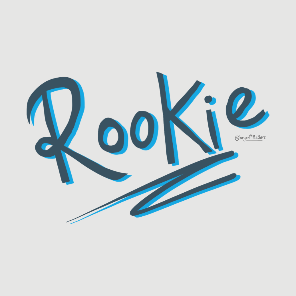
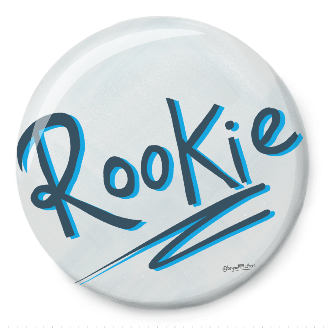
  • At the time, my Rookie was finishing their first 6 months at my non-profit wapisasa CIC, and so I had the opportunity of employing them for 2 days a week. Great experience for them — and a companion on the journey for me. Find good people — keep good people.
  • If we made any surplus, I decided it would go to wapisasa, and therefore help develop more Rookies, making this a sort of fundraiser rather than a profit-maker. As a result, we decided that Indiegogo would be a more appropriate crowdfunding platform than Kickstarter. I’m not about profit; I’m about people…

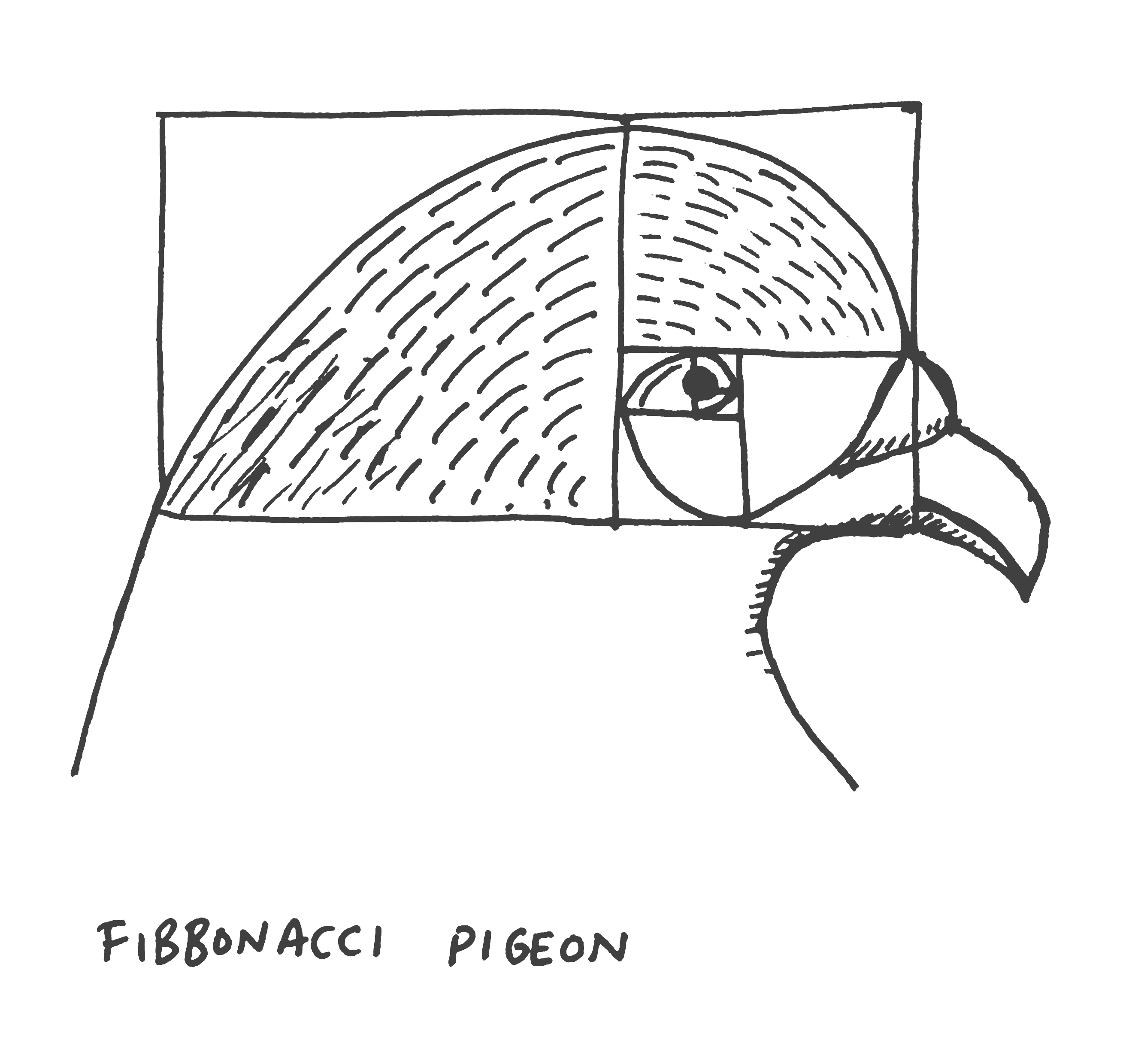
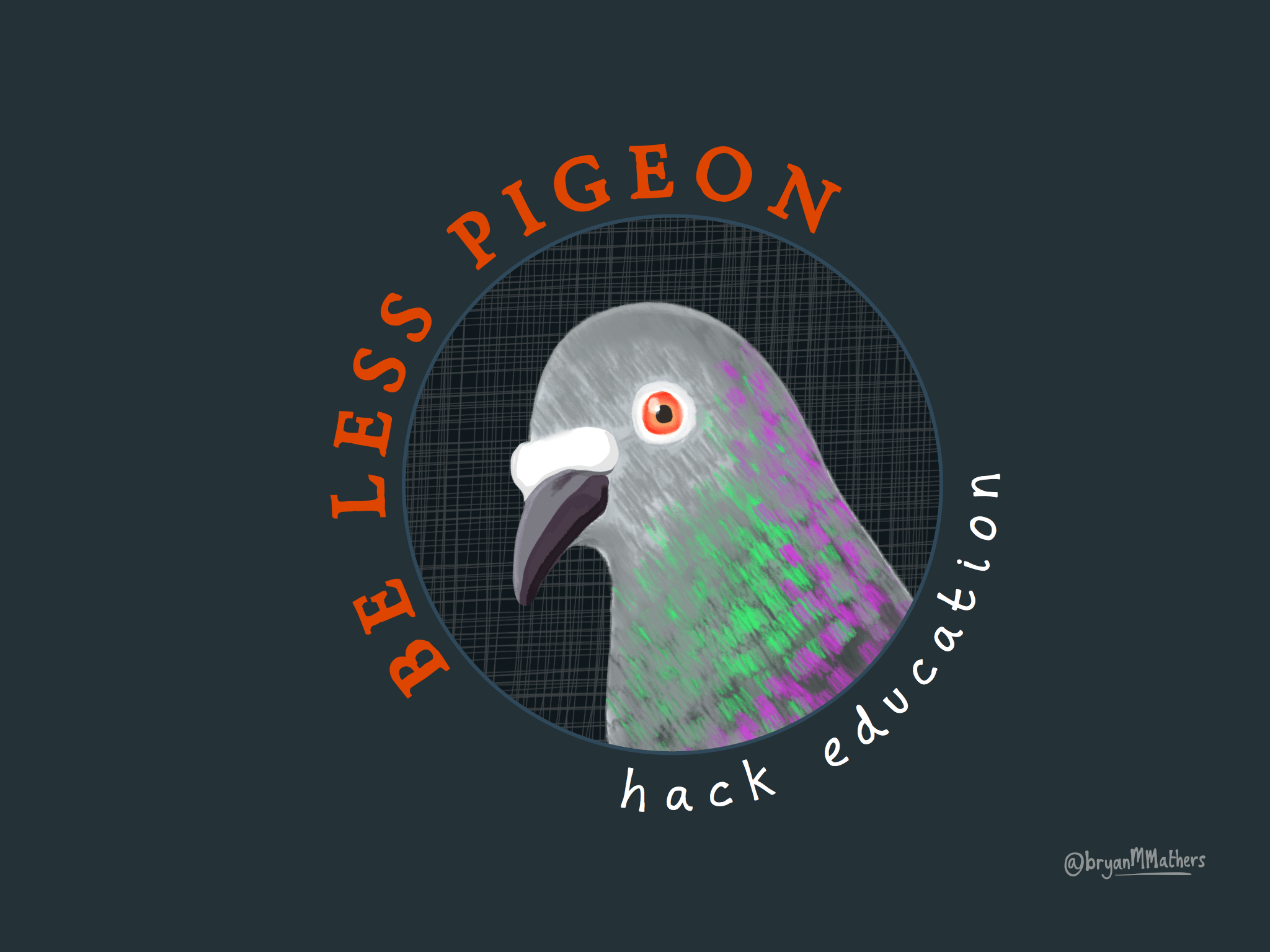
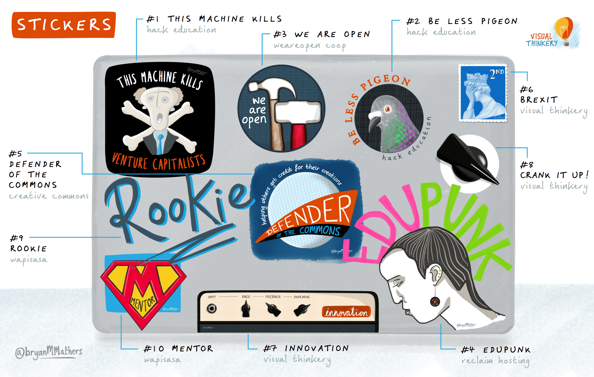
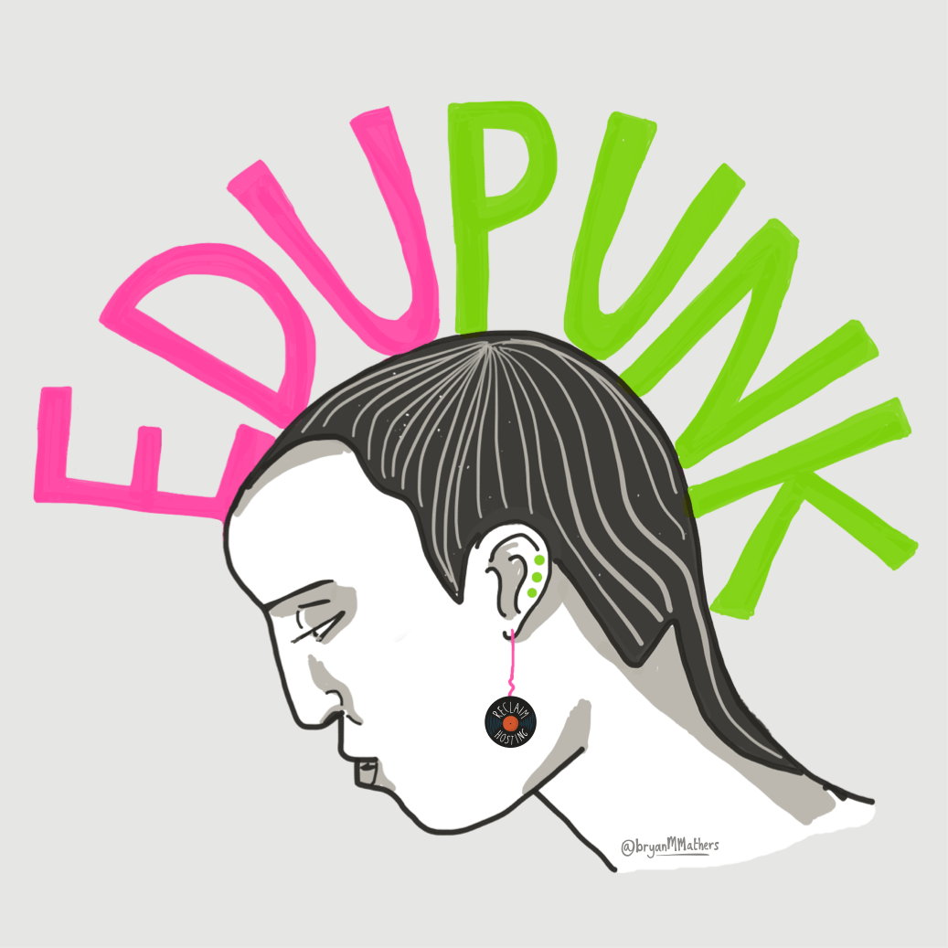
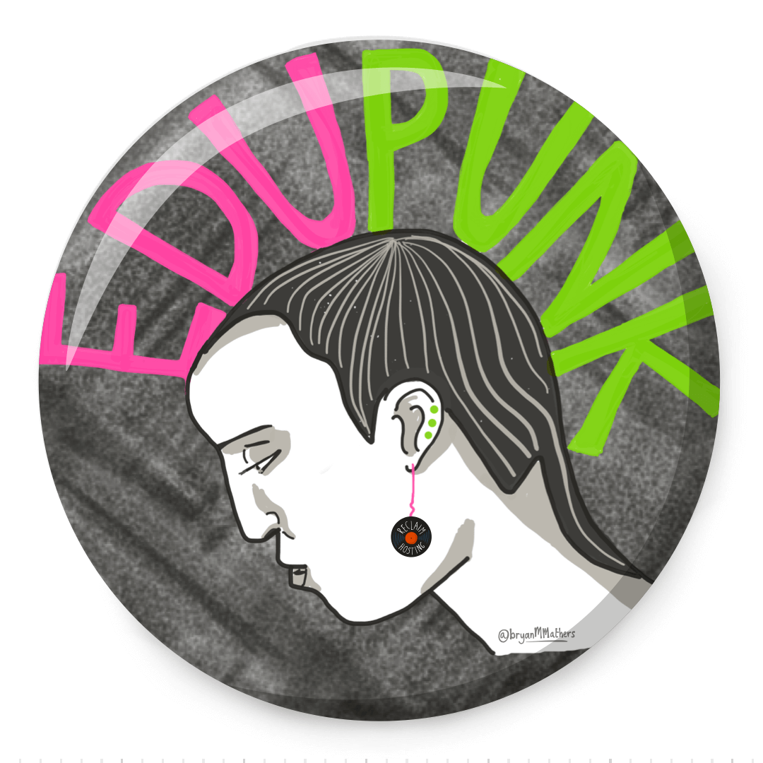
Most of the stickers I chose were created as a result of a conversation with someone (that’s where the gold is, I tell thee!). As I consider it to be some of my best work so far, I asked Audrey Watters and Jim Groom if they would be happy with us including designs I had done for them. Awesome people that they are, they were quick to give me their support and encouragement.

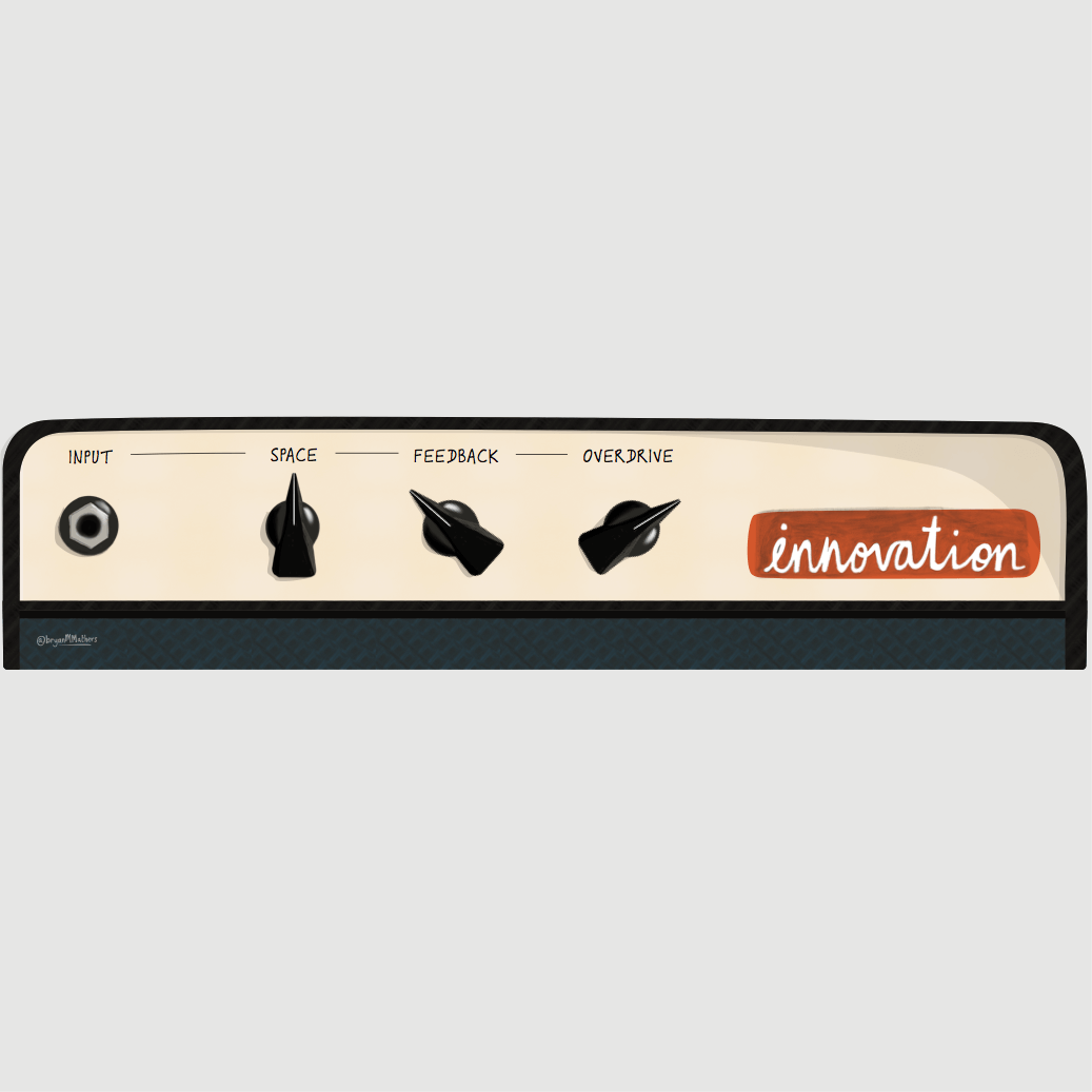
After getting the artwork created, we ordered a small prototype print run to see what the feel and quality was like. I was keen to experiment with transparent-edged stickers, hopefully giving a “tattoo” feel, which I think fits with the creations. This idea led to us dipping into tattoo metaphors and lingo. When the prototypes arrived, I wasn’t disappointed —  I immediately had to put them all over my laptop — and they’re still there!

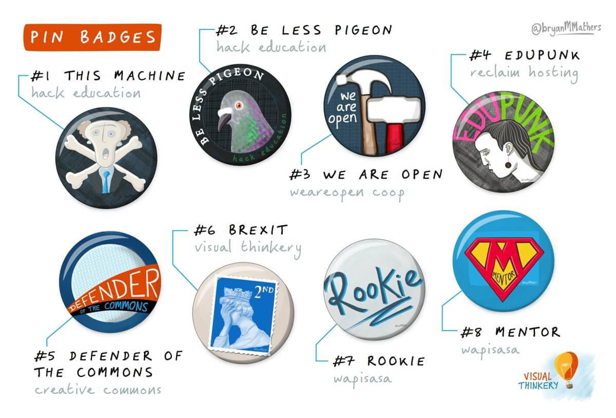
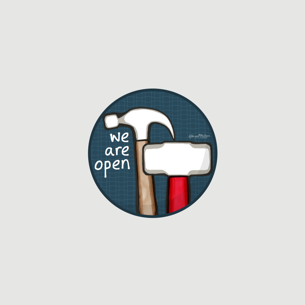
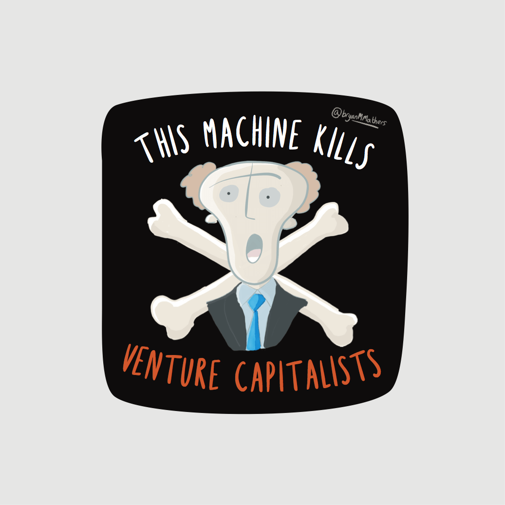
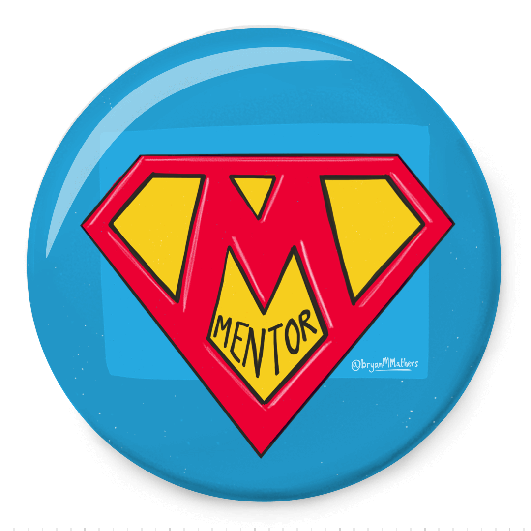
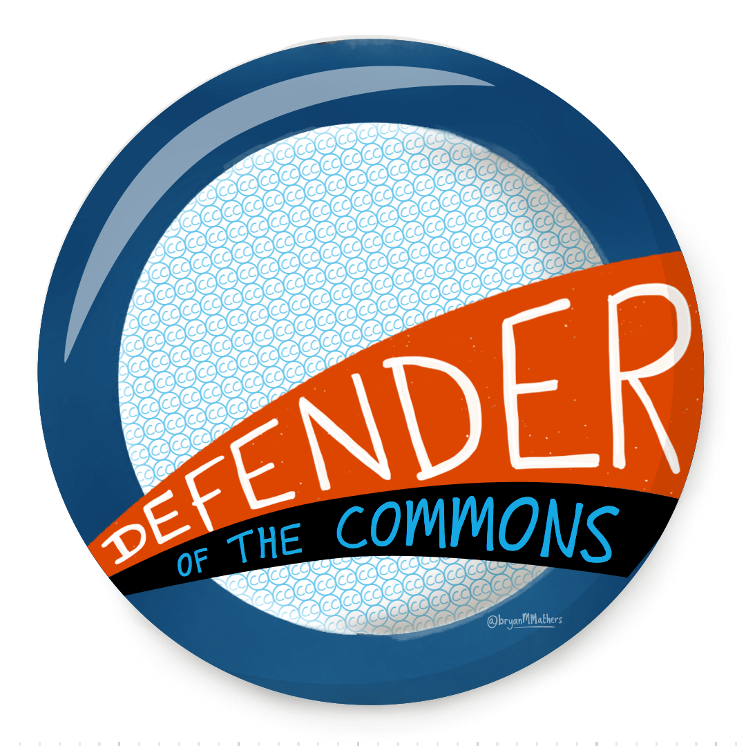
Whilst we were busy thinking about stickers, an offer came serendipitously across our paths to also get some pin badges (or buttons in the US) made too. So we decided to add those to the campaign as well…

So the product shaped up — but what I hadn’t banked on was how much work it was to articulate the message of the campaign. 

One thing I always try to do when thinking about articulating anything is to tell the story. I think about a hero, a villain, the hero’s vision, and their plan…

This campaign has now completed. Here’s how we got on.

Reclaim Hosting

An aesthetic logo

Reclaim Hosting

Back in the summer of 2015, I was sipping a coffee in Barcelona with Jim Groom, co-founder of Reclaim Hosting. I couldn’t help notice how he talked about his edtech startup. It struck me that he talked as if he was the owner of an independent indie record store. And so the “Reclaim Records” aesthetic was born… (here’s Jim’s take on it)

Firstly we looked through all the messages of Reclaim Hosting through the new lens of this fresh metaphor. Greatest hits, Classic Albums, Record sleeves, Stereo, the shop itself. Every time we came back to the metaphor, it gave us a different idea. Each individual message demanded a graphic. Following that, we thought about spinning it up – and making the records play. Each idea a journey that enveloped the previous graphics and incorporated them.

Inside the store...
Now in stereo - backup as default
A domain of one's own
Edupunk
Reclaim Records

Say Hello!
If you'd like to talk with us about a project, we're all ears!