INC-4: Global Cartoons for a Global problem

Welcome to INC-4 Ottowa

Global Cartoons for a Global Problem

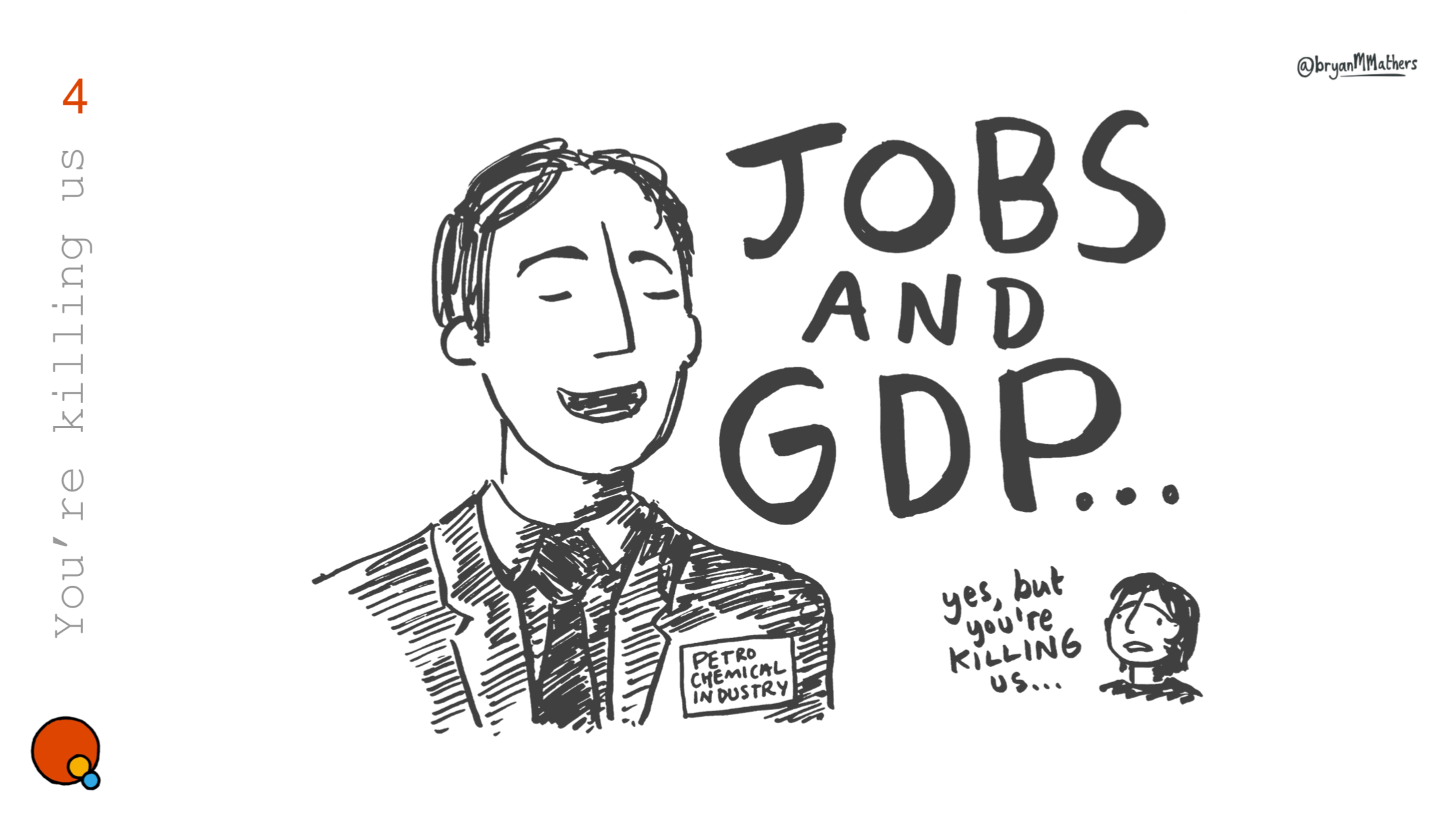
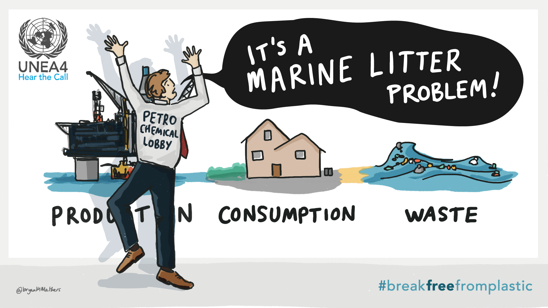
Goodness knows we need one: a global treaty on plastics. But Big Oil with its stranglehold on the stuff of life is lurking with unlimited lobbying resources. Their playbook is one learned from Big Tobacco and Big Sugar: delay, distract, derail

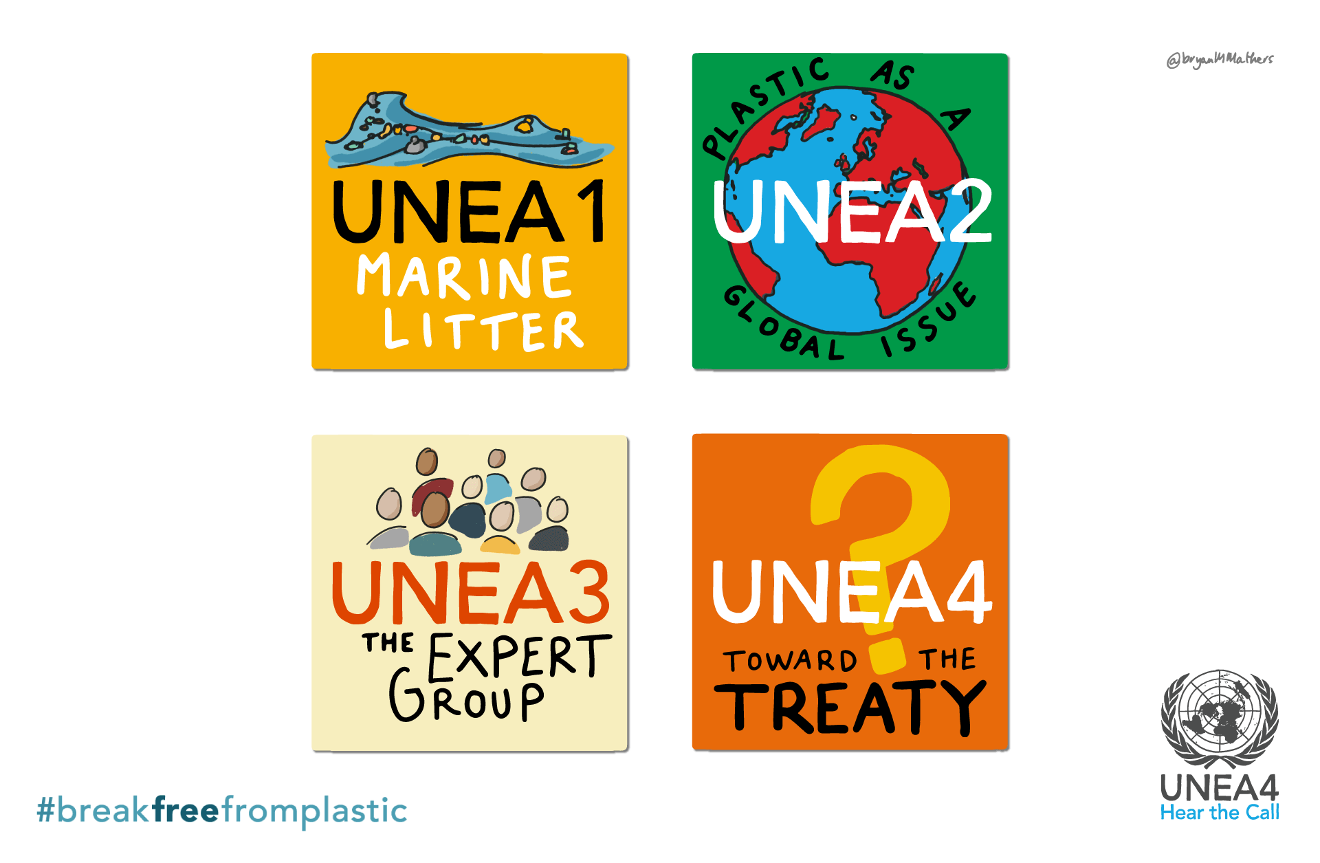
Last week, I was covering the fourth session of the Intergovernmental Negotiating Committee (INC-4) for the BreakFreeFromPlastic community as they met in Ottawa, Canada, to develop a legally-binding global treaty on plastics.  It’s always a bit weird covering a conference when you’re not physically present. The beginnings of my best cartoons (in my humble opinion at least…) often emerge from an insignificant bit of detail in a conversation. A throwaway comment. A metaphor leaned into. The beginning of a story. So instead I have to rely on having eyes and ears in the ground and a whatsapp group for creative members of the community to throw things into Bryan’s cartoon ideas melting pot. It would be impossible without my contact – she’s actually at the conference, able to corral the troops and filter out the noise, preventing ideas from getting over-thought and overcomplicated.

Biobabble
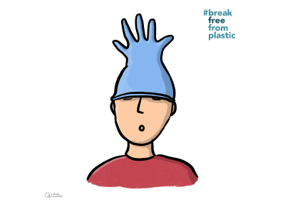
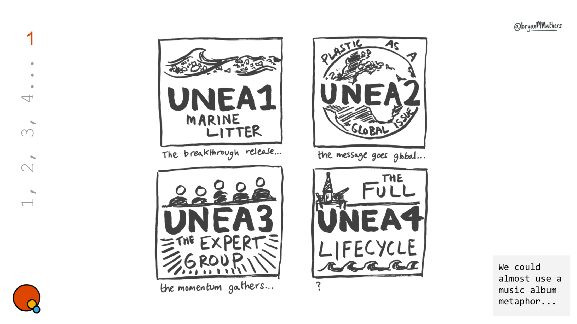
One of the initial moosy ideas for INC4...

I sketch up ideas in black & white – so as not to be distracted by colour. It means that I prioritise contrast over colour – which is important as there are some parts of the message that really need to pop. 

When you’re creating a cartoon, you’re inside it. It becomes very hard to see it objectively as someone else would with fresh eyes. It’s similar with humour. Once you know the joke, it’s different second time around. So it’s easy to go from being initially tickled by an idea to binning it within the space of half an hour. So the process is this:

1. Catch the idea

2. Sketch it up

3. Move on (before you kill it…)

Time Machine
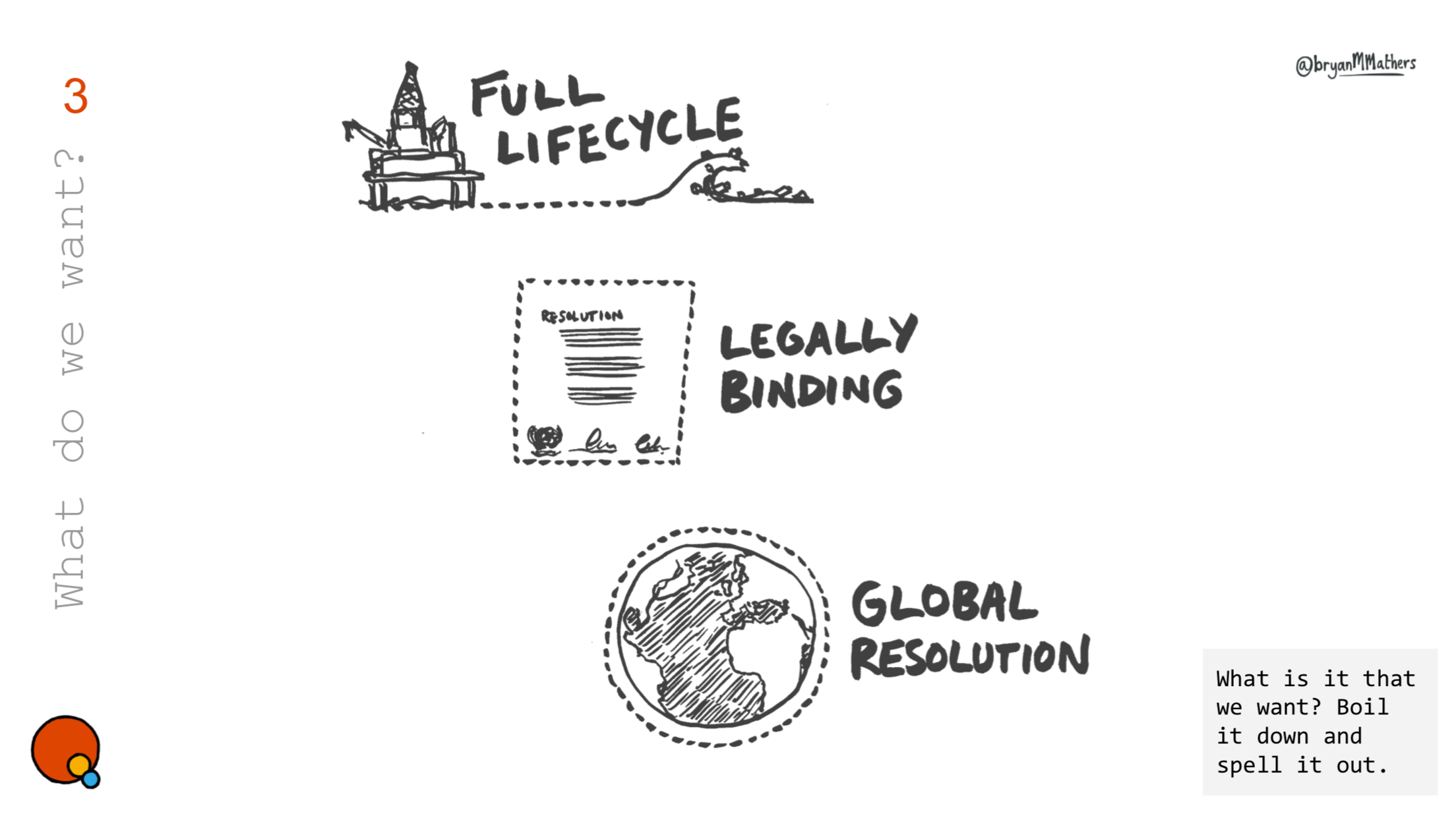
So much time was wasted revisiting the treaty scope. Kicking the process into the long grass is a tactic as old as time…
Its a marine litter problem INC4
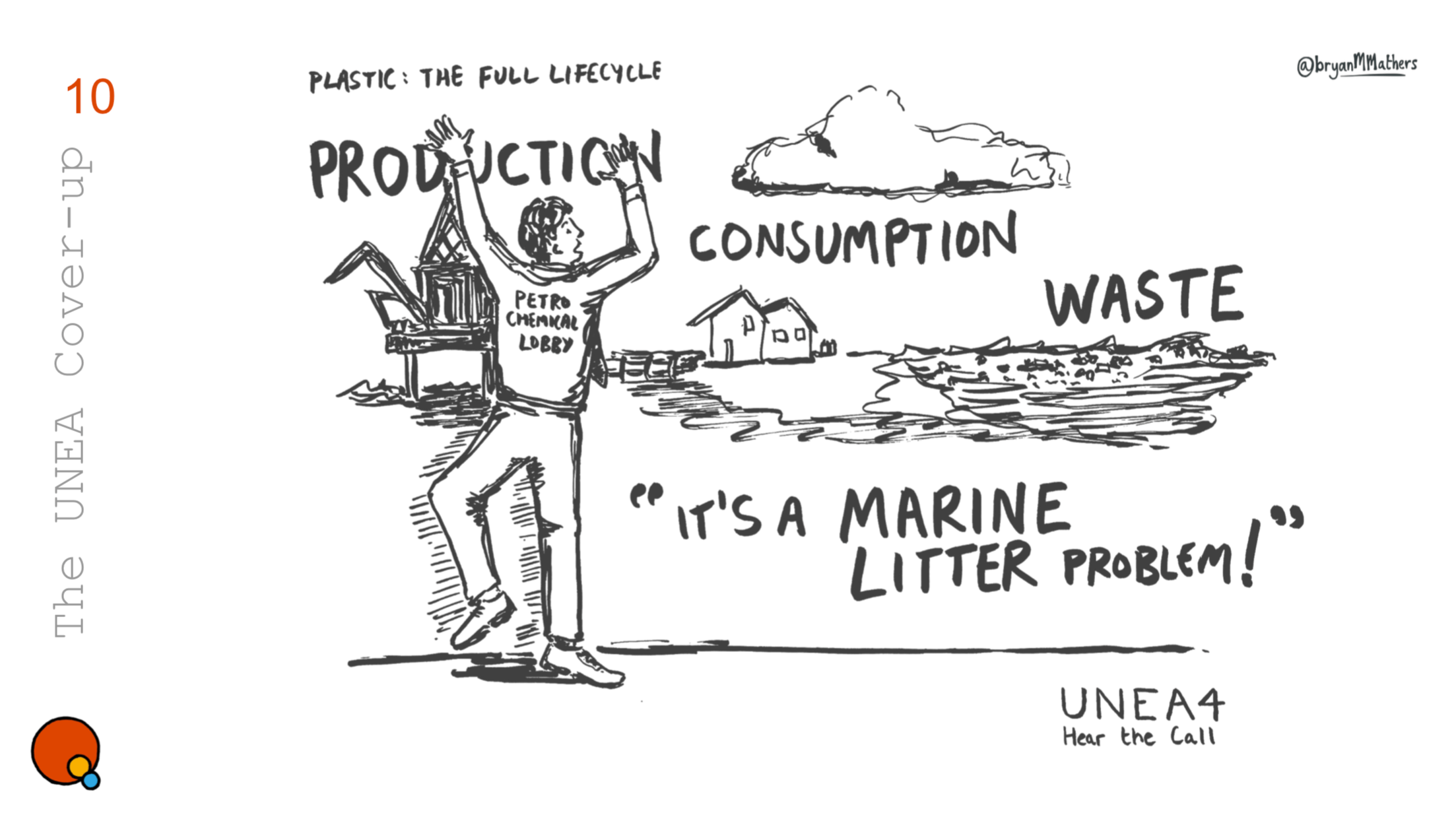
This cartoon was originally drawn 5 years ago, but it is still as appropriate today… 🙁 It was remixed and reused following “Plastic isn't the problem” comments from the Exxon CEO leading up the negotiations.
Co-opting concerns
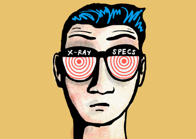
Was this idea too edgy? Possibly…
Ha Ha Hadditives
Have you ever thought about the presence of toxic additives in plastic products? No, me neither.
Bioplastic
Bioplastic is the future! Oh now hang on a mo…

When it comes to Plastic Pollution, I’ve learned so much from the people I’ve had the privilege to work with. Not so long ago, I was completely oblivious to so much of the plastic world around me. My own ignorance, curiosity and learning form a key part of the cartoons I create.

Micro and Nanoplastics
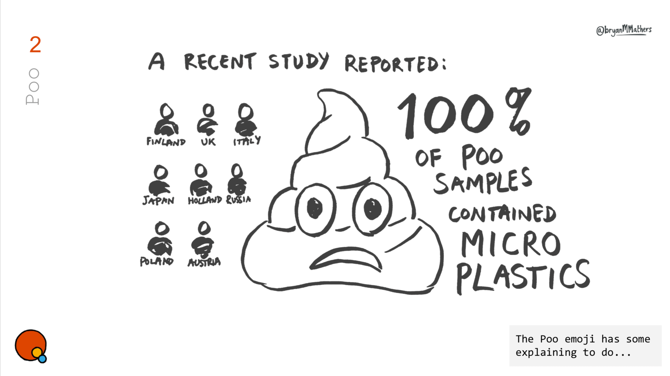
There were several interventions to avoid the inclusion of Microplastics and Nanoplastics - and the metaphor of “shedding a little skin” is actually a direct quote from one of the delegates…
Ineos - you make me sick

Making a cartoon work for a global audience is far from straightforward. However, you’ll know when an idea has resonated when the request comes to facilitate the translation of the cartoon into another language. This in itself can be problematic – and it comes with two main pitfalls. 

Firstly, other languages can obviously use a different number of words to say a phrase. Especially if an idiom is used. For example – “You’re pulling my leg” in Finnish becomes “You’re pulling me by the nose”, in German “You are taking me unto your arm”, and in Russian “You’re hanging noodles from my ears”.  In a cartoon the speech bubbles form an integral part of the artwork, and they evolve as the artwork evolves. Suddenly having to change their shape or size to accommodate a few extra words can cause a real design headache.


The whole nine yards
A visual idiom that probably won’t translate…

Secondly, writing is much slower and proofing is much more difficult. A missing accent or misspelt word is so easy to do, and might remain unspotted to the very last. This adds time to the to-ing and fro-ing of finalising the artwork. I’ve toyed with the idea of making remixable cartoons using the fabulous Remixer Machine. I’ve already created a few comic fonts of my own hand, so giving participants the ability to remix a cartoon with different words is very possible. Hopefully I can have a prototype of the remixable cartoon built for INC-5 – watch this space!


The bridge to busan
The final leg of the treaty process will take place in Busan, South Korea at the end of November.

That would look great on a T-shirt

This here thing

That would look great on a T-shirt

 A long time ago, when all of this was still green fields, I shared a flat at university with a guy that made his own t-shirts. He got them printed at a wee print shop tucked away near Kelvingrove station in Glasgow’s west end. He was particularly taken with the design on the Tetra Pak milk cartons produced by Robert Wiseman dairies. Don’t ask me why. University affords us the opportunity to reinvent ourselves, and he went for milk cartons on t-shirts. On reflection, he was quite possibly ahead of his time. 

When I sift back through a conversation I’ve recorded with a client, looking for visual ideas, I often find myself playing with a logo, or a hand-drawn unofficial logo, and wondering what it might look like on a T-shirt or as a sticker on a laptop. 

There’s something pretty powerful about someone wanting to wear a t-shirt or to stick a sticker on their laptop. They’re saying I’m aligned to this – this is part of who I am

Over the last year I’ve been working on a series of Zines – cartoons and stories about growing up in troubled Ulster. The third Zine in the series looks back to a disremembered time when Ulster Presbyterians cradled the fragile beginnings of Irish Republicanism back in the late 1790s. It started as a secretive group called the Muddlers Club. It evolved into the Society of the United Irishmen. It ended in a failed bloody uprising that would change Ulster forever.

But of course I never knew about any of it until recently, as to some it has proved an inconvenient history incompatible with the tribal polarisation that dominated Ulster in my youth.

Badge of United Irishmen

It is new strung and shall be heard…

When I stumbled across the United Irishmen movement’s logo, I was immediately fascinated with it. It sparked a curious idea to create my own version of the Muddlers Club logo – which ended up becoming central to the Zine I was trying to write.

Drawing on an iPad with RGB colour allows you to put bright orange on top of a deep blue. Turn the zing up to 11 and make it pop! And it wasn’t too long before I returned to it and thought – I wonder what that would look like on a T-shirt?

The Muddlers Club

I get most of my T-shirts and stickers printed by Sticker Mule these days. They run an offer every week that often catches my eye. It’s perfect for a small pilot run – to test out an idea – to turn digital into physical. The trouble is that most of my T-shirts are now self-designed experiments, and I can only wear one at once! 

Me wearing a custom T-shirt

Bryan sporting a self-designed Penguin T-shirt designed for GO-GN

Stickers on the other hand are a whole different matter. I decided to get a run of stickers featuring the Muddlers Club logo for the special first few people who ordered the latest Zine. 

Mags Amond - Post

Zines & Custom Stickers

If you’re interested in some Zines about Ulster you can check them out here.

AND if you’d like to get some custom stickers or T-shirts made by Sticker Mule and you want a discount you can get £8/$10 off and if you do, I’ll get the same off my next experiment…

BFFP – Gloves and Masks

BFFP - Gloves and Masks - Glove Head

BreakFreeFromPlastic – Masks and Gloves

I’ve seen them on the streets around where I live. Discarded surgical masks that no-one will touch. Encouraging others to see the impact this has on our environment is no easy task. 

As always with the Visual Thinkery process, we met as a group to have a facilitated conversation about the issues at large.


BFFP - Gloves and Masks - Surgical Gloves


I (Bryan) try to catch as many visual ideas as possible. At the outset it’s hard to know what will resonate with the process participants or the audience. Going wide, and creating at least 10 ideas allows us to test and measure what resonates, in order to then improve or combine ideas further.

I want a better future

What is the motivation behind the making/buying of a reusable mask. Self preservation probably for most, but what about a sense of hope for the people we share community with?

BFFP - Gloves and Masks - I want a better future

Sit back and prepare for takeoff…

A strong idea to emerge from the conversation was the aesthetic of Airline Safety Instructions. As a metaphor, it’s very recognisable: “Place over nose + mouth and breathe normally” with lots of opportunity for adding a degree of humour…

BFFP - Gloves and Masks - Safety Instructions

Often there is a requirement for multiple translations of the same visual ideas. Also, splitting into engaging chunks for social media campaign engagement.

BFFP - Gloves and Masks - Safety Instructions

Look mom, no words…

If there’s a way to talk in pictures without using any words, it’s also worth pursuing.   

BFFP - Gloves and Masks - Happy Planet

And Finally

The idea of a “wave” of plastic came directly from the conversation, so by creating a custom brush, we did just that. Find out more about BreakFreeFromPlastic’s Mask and Glove campaign.


BFFP - Gloves and Masks - Wave of Masks

DRS Manifesto

CMALT Core Principles

DRS Manifesto

The team from Zero Waste Europe got in touch about developing a visual aesthetic for a manifesto they had created. Manifesto you say? Yum. But what is a DRS? I’m glad you asked. As I soon learned, DRS stands for Deposit Return Scheme. It involves a product manufacturer charging slightly extra (the deposit) when using a container and then refunding this extra cost on the container’s return. This way, plastic containers can be collected by the manufacturer and reused or at least recycled.

In terms of visual ideas it was obvious that this manifesto would need to educate the reader. So that meant getting visually underneath the explanation of the DRS. I started thinking about what a DRS brand might look like, and by playing around with the letters, I noticed that the R and S could interact in a way that might suggest actions of deposit and return. 

The EU flag is circular in appearance, and therefore lends itself well to saying something about a circular economy. 

I also noticed quite by accident when putting all the partner logos together that they could form the shape of something: a container – a great metaphor for the manifesto itself. We’re all in this together.

After the first draft, the team suggested adding more of a human element to the aesthetic. This is where the idea for the many hands lifting up the containers came from. Suddenly there was a different feel to the manifesto – it somehow became active! The power of the human body to subconsciously communicate.

Overall, the team felt that we’d struck a good balance between professional and punchy, and it’s true – the hand-drawn elements feel friendly and genuine, whilst the typeset narrative feels authoritative. Most importantly, it carries a simple design, and it’s this playful simplicity that disarms the intended audience and allows them to engage with the manifesto and it’s message. 

You can read more about the DRS Manifesto here.

UNEA4

Creative Commons Certificates

UNEA4 – #BreakFreeFromPlastic

There’s something about working with activists. They speak from the heart. I find them very easy to listen to – to tune in to. They’re often great storytellers too – and stories describe pictures…

The brief was to create visual assets for United Nations Environment Agency summit in Nairobi, Kenya. 

Dialogue

Our virtual session spanned the globe.  Jane was already in Nairobi at the pre-summit, and Jed was organising from the Philippines, and sketched and scribbled in London.

The number of ideas betrays the richness of the conversation – and we had no trouble creating collaborative ideas to that we felt people could align to.

Distill

Humour disarms, even if it’s sometimes pretty dark. I often listen out for those bits of insight that sit behind the humour as they’re often pictorial. Here’s some of the final artwork we created:

Say Hello!
If you'd like to talk with us about a project, we're all ears!