Documentary Cartooning

Aligned Values and Behaviours

Documentary Cartooning

At a recent two-day gathering where I was busily trying to capture insight in cartoon form, a man came up to me and said – “I’ve figured out what you’re doing – you’re documentary cartooning!”. On reflection, he was quite correct. I’m trying to lean into conversations as they arise and when a visual idea presents itself, I grab it with both hands and let it come to life on my page – documented for others to derive meaning from long after the event has taken place.

For the last few years I have been experimenting with different ways of capturing and documenting live conversation as it unfolds. There are a few different techniques. 

The Conversation Landscape

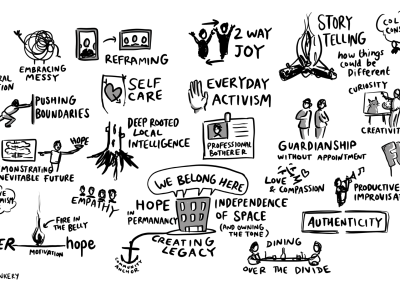
One way to capture the richness of a group’s thoughts or reflections is to live draw the session as it unfolds. The drawing above represents a 60min reflective session where a group of 25 people had previously split up into small groups to think about shared values and behaviours and write their responses on postcards to help with feeding back to the main group. There was a bit of overlap between groups, so as a point was made, it was grouped with others and group’s audible response gave an indication of resonance. 

Output: Gives the feeling of having collaboratively created something meaningful. After the event it’s a great aide-mémoir for those who were part of the conversation, as technically the conversation has been mapped.

Struggle Bus

Nuggets of Insight

When people get together and share in conversation, nuggets of insight appear amidst their words. Metaphors, humour and storytelling all provide clues as to what the insight could look like as a visual expression. 

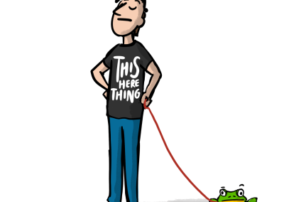
The “Struggle Bus” example below is a good example of an off-the-cuff comment that resonated with a room full of social entrepreneurs. It tells a story of how hard it can be to get a social project off the ground – but that we can still get there. And it helps to know that there are others on the bus too! Interestingly, as a visual, there is plenty of productive ambiguity in the cartoon. Am I ready to get on the bus? Maybe if I sit beside the right person, they can help me? Different people will add different meaning.

Output: As individual cartoons, these digital assets can have impact long after the event, and inspire people who weren’t there. They can be a useful hook for a blog post and on social media, and can be made available to the participants to use under a Creative Commons licence.  

Thanks SO much again – your thinkery captured the nuance and metaphor of our dialogue as always, and it’s made the follow-up communications a pleasure to do <3

Bex Trevelyan

Platform Places

alt23 sketchnote - Anne-Marie Scott

Keynote Sketchnote

A keynote sketchnote is a visual landscape created live while tuning into a person deliver a presentation, usually at a conference. The example above was created during a keynote by Anne-Marie Scott at the ALT conference.

To me, a keynote feels like a journey. There’s usually a defined theme which flows through the presentation. Some pitfalls and highlights. An opening gambit and a measured conclusion. Often there are visual clues provided by the speaker in the way of slides. The challenge here is to be playful with all of the above, and see if it all can be balanced on a single page.

Output: This form of illustration can be a great way of sharing the “gist” of what someone just spoke about to the wider group who might be connected to the event but weren’t able to attend. 

25 Years of EdTech

25 Years of EdTech - Cover

25 Years of EdTech

Martin Weller, Professor at the UK’s Open University, got in touch regarding the aesthetic for a book he was earnestly applying the finishing touches to – 25 Years of EdTech.

Of course, as Martin knows, the Visual Thinkery process means that together we’ll create 10 book covers, as well as anything else we pick up along the way. This includes even suggesting alternative titles for the book (which is outrageous, when you think about it) but even this creates a different lens to get an alternative glimpse through.  

Interestingly, the first idea was the one that eventually stuck:

25 Years of EdTech - X-ray Goggles


But there are a few others that I think deserve an honourable mention. I was tickled by the idea of a relationship between parent and child (but I want to go this way!

25 Years of EdTech - Ed & Tech


And it’s not long before I’m drawing robots. (And then the world of assessment will be miiiiiiiine!)

25 Years of EdTech - The scaling up of Edtech


I like “The Web Years” as it reminds me of the common biographical strapline (the wonder years, the wilderness years…) and suggests that there has always been some sort of technology in Education, but only recently has it involved the web. Here we go again, here we go go go to the temple of consumption… (apologies – you probably didn’t need reminded of that song…)

25 Years of EdTech - The Web Years


ISDN – Now that will change everything…

25 Years of EdTech - Dodgy Connection


We’re never far from someone taxonomising all the things. But not me – I’m more of an alchemist…

25 Years of EdTech - Alchemist's Handbook


In reflection, there were small elements from a number of these ideas that made their way into the final cover. Some consciously, and others less so.

Now Remix this…

As part of the promotion of the book, AU Press asked if would be possible to create a remixable front cover. So I (Bryan) set about separating the visual elements so that they could be remixed using the Fabulous Remixer Machine. Hair highlights, skin tone, background – but maybe more importantly the text on the glasses and the strapline at the bottom. Have a go!

25 Years of EdTech - Remixer

And Finally…

Quite often ideas appear as mini-stories in 3-panelled comic strip format. A couple of these made it into the book. I don’t think it matters what the content relates to, there is always a place for visual humour… 

25 Years of EdTech - Year Zero

GO-GN

GO-GN

I love a wide brief. Getting people together, and using dialogue to see what we can be unearthed. GO-GN is a postgraduate research programme, connecting and furthering those involved in researching Open Education. They asked if I could help with a brand refresh, and create a set of visual assets along the way.

In order to capture all the voices, we took the approach of facilitating two conversations: one for participants and a second for the GO-GN team.

GO-GN Thinkery Conversation
We had two really rich conversations. I live draw while the conversation is taking place, by using a document camera, but also record the conversations so I can go back through them later and harvest and clues I can tune into. 

Ideas

A rich conversation also leads to many ideas. My aim is always to capture as many of them as quick sketches.

GO-GN suitcase sketch

Creating a Visual Language

The trouble is, creating a fresh brand for an organisation is tricky. In some ways it’s like buying a bold new coat. Liking it isn’t enough. You’ve actually got to wear it. What are you as an organisation trying to say? To whom are you trying to say it? If you find an aesthetic that fits well enough, it can be used as a visual language, to communicate a feel which is sub-consciously absorbed. 

One of the prompts in our discussion used a poster-making technique to unearth ideas from the participants on the call. An idea emerged relating to “the golden age of travel”, which led to us nailing down a bold visual language. It’s quirky yet intentional. It has momentum built in.

A quick shout out to the Fabulous Remixer Machine – for providing the necessary inverted earth projections too!  

Listening with your eyes open

Video conversations underpin the Visual Thinkery 10 ideas process. By seeing someone as they talk, it’s possible to hear a richer voice. One of the participants in the call, Caroline Kuhn, used this gesture while speaking of the care and respect that exists in the GO-GN network. And it had to be drawn…

UNEA4

Creative Commons Certificates

UNEA4 – #BreakFreeFromPlastic

There’s something about working with activists. They speak from the heart. I find them very easy to listen to – to tune in to. They’re often great storytellers too – and stories describe pictures…

The brief was to create visual assets for United Nations Environment Agency summit in Nairobi, Kenya. 

Dialogue

Our virtual session spanned the globe.  Jane was already in Nairobi at the pre-summit, and Jed was organising from the Philippines, and sketched and scribbled in London.

The number of ideas betrays the richness of the conversation – and we had no trouble creating collaborative ideas to that we felt people could align to.

Distill

Humour disarms, even if it’s sometimes pretty dark. I often listen out for those bits of insight that sit behind the humour as they’re often pictorial. Here’s some of the final artwork we created:

API Evangelist

CMALT Core Principles

API Evangelist

The thing I love about this sort of work, is that there is so much to be learned from other people. Kin Lane (aka API Evangelist) knows what he’s talking about when it comes to APIs (Application Programming Interfaces). Not just how they work, or how to build them, but how they’ve evolved and the impact they can have.

Kin asked if I would help evolve the visual identity for API Evangelist.

Dialogue

We arranged a remote video session (Kin was in Los Angeles, whilst I’m based in London) and to make sure that I caught as much of what Kin was saying as possible, I recorded our video conversation for good measure. That way, I can go back through the conversation and let it dribble over my creative brain during the sketching phase of the process. I didn’t want our ideas to be restricted by my lack of API knowledge, and being a former software engineer, I’m very interested in this domain too…

Here are a few sketches the session:


Artwork

Finding a visual identity is not easy. Like a new pair of shoes, how you see them changes as they become part of you. There’s much “stepping into it” required. Also, we’re trying to create something bigger than the person behind it, as its purpose will be to provide a stage not just to speak from, but to build other scenes on top of.

…and finally

Humour is often a great indicator of something worth creating. So when a thought tickles me, I try to capture it before it escapes. The artwork below came out of the conversation with Kin, and as a mash-up also allowed be to explore and understand some of Roy Lichtenstein’s work. This artwork ended up as a sticker and can be found on the back of my laptop. 🙂

Making an impact on the world. I enjoy seeing my ideas fluttering around, adding color, adding motion, and presence around the API community. At the moment where I couldn’t imagine any image to represent API Evangelist, Bryan was able to extract a single image that I think couldn’t better represent what it is I do. #VisualThinkery
Kin Lane

API Evangelist, Excerpt taken from this blogpost.

Say Hello!
If you'd like to talk with us about a project, we're all ears!